Does your site have a pulse? Here are three vital signs you should look at. Stat.
We spend much of our time evangalising the basics of content marketing (and the rest on content marketing’s intrepid edge). The point of the content marketing exercise is to make yourself, your site and your people inherently interesting to the market, by sharing more of yourself, your ideas and your expertise. Much google-love automatically follows.
“You mean we just talk about our stuff, and it will sell itself?,” asks many the wondrous executive. Well, something like that. As long as you’re talking about stuff other people are already interested in (not just your own products), then, yes, that’s basically it.
The main point is this: You can draw people to you and get them to buy your products by providing compelling information on your site. Get them to come. Get them to stay. They’ll become customers in the course of time. That’s the basics anyway.
So how can you find out if your site is serving the content marketing purpose? How do you know if you’re really offering a compelling content marketing experience that will draw in the crowds, keep them around and convert them to paying customers?
For a client, we studied their website analytics to assess just this, and enroute we discovered three pretty core vital signs to see if a website’s content marketing chops are in place. (When I say “we”, I mean me and Neil. And, when I say “me”, I mean mostly Neil – our analytics guru).
Content Marketing Vital Sign #1: The Dead Cat Toss
You’ve heard of the dead cat bounce perhaps. It’s the upward blip of a market after it’s crashed and burned. The corpse bounces up briefly, before falling down again. Well, this is a different trajectory that I playfully call the dead cat toss. Here is one dead cat toss:

Generally, we see a site plugging along with steady traffic (note the typical weekdays to weekend rhythms), then sees a big spike – what I call “the toss”. Usually, this relates to some massive campaign, involving an SEO-keyphrase laden press release fired hither and thither, some guest post blogging and/or a big email blast. Traffic briefly spikes; the cat soars up and then falls back down.
The true measure of a website that is using content marketing well is its performance after the spike/toss. If it quickly drops back down to the normal pattern, then we’re looking at a site that fails to convince visitors to return for compelling content. If it goes back down to a level some degree higher than it started, that’s a content marketing success. The site above is a typical content marketing #fail. If you saw a graph of our site after our B2B Marketing Manifesto or Content Marketing Workbook were published, you’d see typical content marketing #win.
The Dead Cat Toss simply measures whether an effort to increase a company’s effective audience has had any success. Anyone with access to a mailing list or emailing software can create a little traffic spike, but only good content marketers will convert that spike into long-term repeat traffic.
Content Marketing Vital Sign #2: The hourglass figure
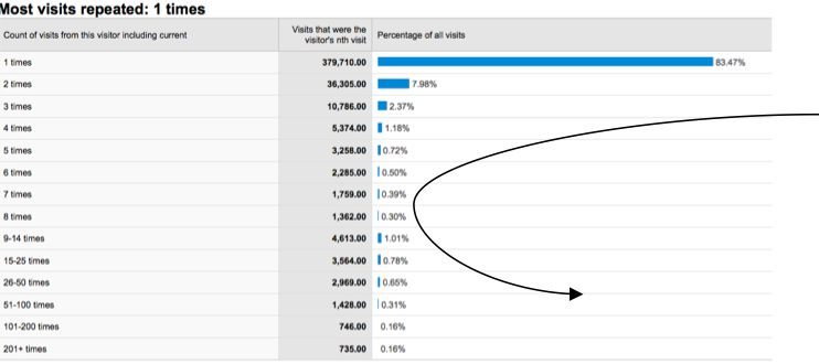
This vital sign can only be measured by visiting a dusty, often-neglected little corner of Google Analytics called “visitor loyalty”. Here you’ll see a bar graph that maps out how many times each of your visitors have come to your site. At the top, you have the people who came once and ran away screaming (they never came back). At the very bottom, you have the people who go to your site like pilgrims to a temple (say, your webmaster).
Here’s the same site we looked at above. As you’ll notice, most (almost all) of their traffic sees the site and flees in abject terror. That’s a dramatization meaning they found nothing of use or beauty there. They have very many first-time visitors, then the frequency of repeat visits scales down rapidly, and never rebounds.

It is this rebound of higher-frequency visitors that we expect to see with good content marketing sites. Generally, a site with a good content marketing experience will see high totals at the top of the graph (many people become aware), lower totals in the middle ground (non-following repeat visitors are a true rarity) then a rebound of totals toward the bottom (the followers).
We expect good content marketing sites to display a nice hourglass figure. Note: You usually have to discount the very top bar of one-visit-only visitors to see the hourglass (as the bouncers skew the trend).
Content Marketing Vital Sign #3: The Jesus Pizza
Our last content marketing vital sign plays off of a parable (because there’s nothing our MD likes more than Christian references): specifically, the parable of the feeding of the multitude. The scene is set in Google Analytics’ New vs. Returning visitors statistic.
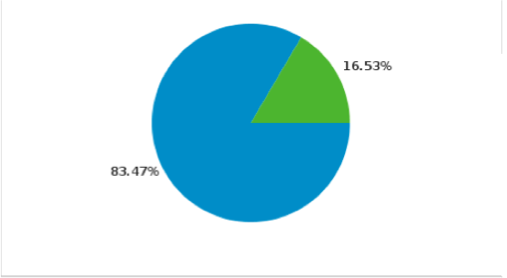
This is closely related to the two preceding statistics, but puts things in a very black/white perspective. We see a pie, with our one-time visitors in blue and our returning visitors in green.
Content marketers want to increase the green share of the pie. Like the feeding of the multitude, where many people were fed by a constant, limited amount of sustenance, a website should be serving its visitors repeatedly. That little green pie piece should get big and fat.
Our own site has about a one-third/two-thirds ratio between returning and new visitors. Presumably, Google.com has a ratio of 99% returning to 1% new. Marketers shouldn’t be happy with anything less than a figure of returning visitors in the high 20s.
So marketers, do like JC or your own personal multitude-feeding saviour of choice, and feed people again and again from your content marketing pizza (probably the first time that term has ever been used, you think?).
Now, go to your site and see how you perform against the content marketing vital signs!

Enjoyed this article?
Take part in the discussion


Comments
There are no comments yet for this post. Why not be the first?