


Velocity’s next era
Jessie Tracy | 22. 10. 2025
Our industry is going through its own Big Moment of Change. So we’re starting a new company (and building new tech) to do something about it.
Read more
Jessie Tracy | 22. 10. 2025
Our industry is going through its own Big Moment of Change. So we’re starting a new company (and building new tech) to do something about it.
Read more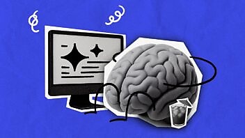
Overindulging in AI causes a critical thinking hangover. And now we have the evidence for it.
Luke Gain | 10. 06. 2025

A conversation with Shruti Bhat, previously CMO and CPO at Rockset, about the moves that established the company as the leader of Real Time Analytics.
Luke Gain | 08. 05. 2025

Is it better to build your B2B community on LinkedIn or should you focus on driving traffic to your site? Fun thing: we have new data on that.
Neil Stoneman | 17. 04. 2025
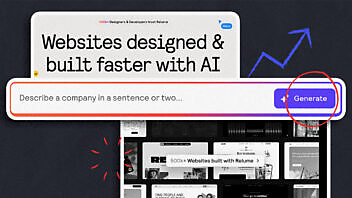
Relume’s homepage nails B2B value exchange—no forms, just instant, delightful product experience. Here’s why it works.
Cameron Williams | 27. 03. 2025

A B2B brand marketing strategy can be hard to measure without big investment. But you can track awareness trends with just a bit of long-term planning.
Neil Stoneman | 12. 03. 2025

A lack of value symmetry means buyers are avoiding your marketing. But what do buyers actually value? And how can we rebalance?
Cameron Williams | 19. 02. 2025

Most marketing benefits companies over buyers. Discover why B2B marketers must shift from self-interest to buyer advocacy.
Cameron Williams | 29. 01. 2025

The B2B marketing funnel is killing your marketing strategy. Jobs to Be Done is a two-pronged approach to build a content strategy based on your buyers’…
Lisa Dare | 16. 01. 2025

The most impactful campaign ideas start with territory mapping. Try out an approach we use all the time to craft your next creative platform.
Cameron Williams | 19. 12. 2024
Here they are. The latest (and greatest? You decide) of our articles, hot off the press.
Our industry is going through its own Big Moment of Change. So we’re starting a new company (and building new tech) to do something about it.
Jessie Tracy | 22. 10. 2025
Overindulging in AI causes a critical thinking hangover. And now we have the evidence for it.
Luke Gain | 10. 06. 2025
A conversation with Shruti Bhat, previously CMO and CPO at Rockset, about the moves that established the company as the leader of Real Time Analytics.
Luke Gain | 08. 05. 2025
Is it better to build your B2B community on LinkedIn or should you focus on driving traffic to your site? Fun thing: we have new data on that.
Neil Stoneman | 17. 04. 2025
Relume’s homepage nails B2B value exchange—no forms, just instant, delightful product experience. Here’s why it works.
Cameron Williams | 27. 03. 2025
A B2B brand marketing strategy can be hard to measure without big investment. But you can track awareness trends with just a bit of long-term planning.
Neil Stoneman | 12. 03. 2025

We will send the latest stuff written just for B2B content marketers exactly like you. Sound good?

Somehow we found ourselves with an amazing bunch of like-minded marketers for clients. When that happens, great things tend to pop out.

Why the content marketing deluge will force all B2B marketers to raise their game and build a great content brand.

It may sound all tree-huggy but it turns out culture matters. A lot. So we tried to capture ours.

Marketers are trained to put their best foot forward and ignore the downsides of their products. This is about doing the exact opposite.
Hey look: a teeny-tiny cookie request. Would you mind? It’d help us out. Click here to read our privacy policy to see why. Or hit “customize” if you’re fancy like that.