

Let me start this by saying there is no one formula for B2B content. Nor, I believe, should there be.
But beneath the surface of every great piece of content, there’s always a clear and considered structure.
And even though the only people who talk about structure are wanky writers like me, it is fundamental to successful content
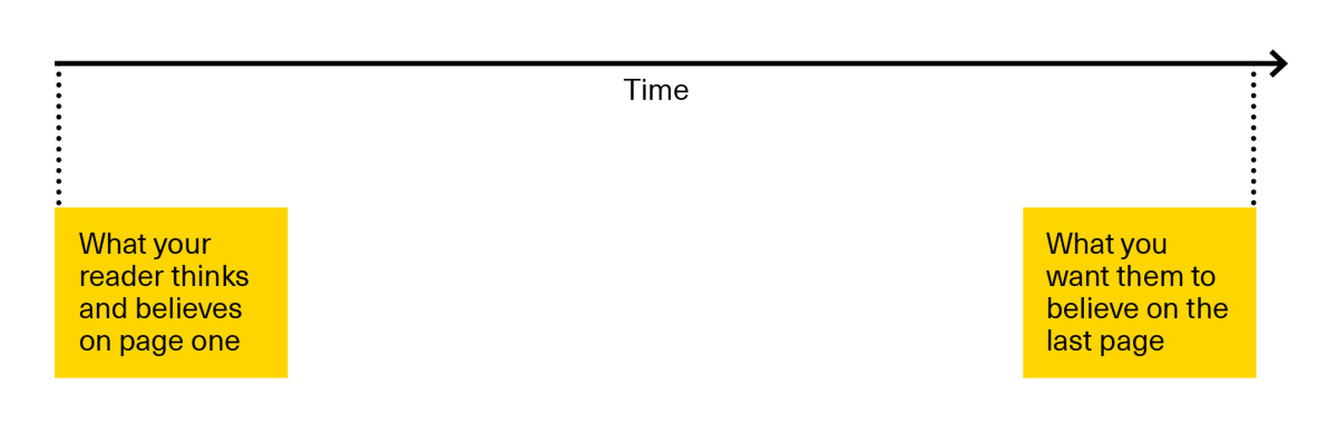
Good structure organises an argument in a logical sequence that confirms what your audience already knows and believes, before showing them what they need to know and believe to care about your brand.
It’s the invisible framework that connects where your prospects are at the start of your content to where you want them to be at the end of your content.
Get it wrong, and your content stutters and stumbles, slowing your reader down or even worse – boring them. Get it right and they’ll breeze right through seamlessly satisfied.
It’s why eight hundred poorly written words take longer to read than eight thousand well written ones.
It’s incredibly powerful stuff. (And the bane of my fucking existence.)
So in this post, I’m going to share a couple of approaches to a structure I use as a starting point for certain types of content*.
Approach #1
In the spirit of stealing from the greats, let’s start by taking a look at how Pixar’s veteran director and screenwriter Andrew Stanton (Wall-E, Finding Nemo, Toy Story) approaches story and structure**.
At its most basic, the structure Stanton uses goes like this:
- Once upon a time…
- And every day…
- Until one day…
- And because of this…
- And because of this…
- Until finally…
- And ever since that day…
If you’re the kind of person who’s watched so many movies they’ve all started to look the same, this structure probably isn’t all that surprising. It does everything you want a movie to do…
- It sets up the world…
- It gives you a sense of what ‘normal’ looks like…
- It pivots when you’re comfortable…
- It threatens the status quo…
- It threatens the status quo some more…
- It resolves the conflict…
- And then it shows you what the new world looks like…
It’s brilliantly simple. And it’s fascinating to watch it unfold on screen (particularly when someone as talented as Stanton is using it).
But in the context of B2B content marketing, it doesn’t quite fit. So a few months ago, I attempted to distill the core components of most B2B marketing stories into a similar structure.
This is what I came up with…
- …is important.
- The old way was…
- But that meant…
- So what if…
- Then you’d be able to…
- And then you’d be able to…
- …let’s talk.
Now I’ll break it down to show you what it’s trying to do.
- It starts by declaring what this is about and why it matters, signaling we all care about the same thing (this could be a discipline, subject, trend or industry).
- It explains how companies used to approach this ‘thing’, signaling that we know how this world works.
- It pivots, explaining why the ‘old way’ isn’t sustainable anymore, detailing the issues it causes.
- It pivots again, explaining an alternative approach. A ‘new way’. A better way.
- It explains the immediate benefits of the ‘new way’.
- It explains the extended benefits of the ‘new way’.
- It leads to a CTA inviting the reader further down the funnel or to just get in touch.
Let’s put it to practice. Say, my brief was to convince you, dear reader, to use the above structure in your content. Here’s how I could do it…
- Great content (what’s important) can win whole markets.
- But too many marketers create content without a solid structure to support it. (The old way.)
- That’s bad. Because it means readers lose interest before you really make your point, which means your content can’t do what it needs to.
- So what if you used a structure that was built to organize your story in a seamless and convincing way?
- Then you’d be able to tell your whole story, confident that readers will want to know what you have to say.
- Even better, your readers will know that when they start reading something produced by your brand, it’ll always be worth their while.
- If you want to know how that structure could work, I’d recommend you read my blog post all about it. Or better yet, just get in touch.
It’s rough around the edges. And by no means, is this a finished piece of content. But it is a structured argument. And it allows me to do some important things:
- It cuts to the chase right from the off, showing you why this was written.
- It explains why the old way doesn’t work and before you know it, it’s offering you a new way.
- It packages the benefits of the ‘new way’ right into the narrative.
- And it uses the momentum built up from the preceding points (assuming you agree with them) to power through a series of ideas.
Again, it ain’t perfect. And I only ever use this structure as a starting point. Because as useful as it is, I invariably break and re-assemble the structure of any piece a dozen times before I’m done with my first draft.
But a starting point is huge when you’re staring at a blank page. More importantly, a solid structure that knows where to start, where to end and how to get there is crucial if you want to produce confident content.
Here’s a slideshare we did that loosely follows this old way/new way structure. Don’t worry about reading it all the way through (it likely isn’t meant for your field). But do note how it uses all the points we’ve discussed to power home a complex story at great pace.
Specifically, you’ll notice slides 3, 8, 10, 16, 25 and 56 all cover the points we’ve discussed (though in a slightly different order – like I said, this is just a starting point).
Approach #2
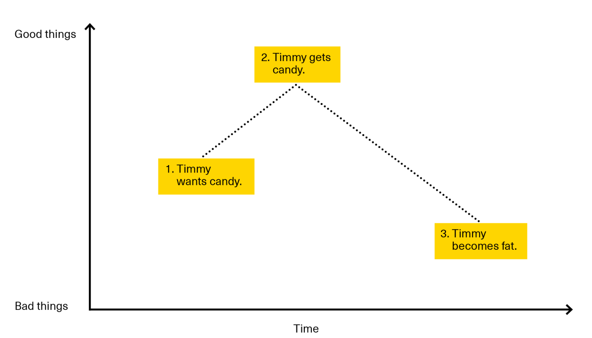
That last approach was based on a series of sentences. This next one is based on a graph. It’s a whole lot easier to plot out (I doodle it on the back of briefs) and it actually highlights a crucial aspect of good structure – the pivot.
The pivot is any point in your story that takes a turn for the worse or for the better.
Pivots are crucial because great stories don’t travel in a straight line. That is, they aren’t just a polyanna positive confirmation that everything in the world is dandy and only getting dandier. Great stories have ups and downs.
This isn’t because of some ancient laws of drama. It’s because that’s how real life works.
Think about it: if you’re selling a product, your job is to sell change. It’s to convince someone else to stop what they’re currently doing and start doing something else. That means you have to have something intelligent to say about the issues (the negatives, the challenges, the problems, the fears, the concerns, the pain points) that your prospects are struggling with.
Not only does this make your story easier to relate to, it actually earns you the right to describe the benefits of your solution later in the story.
With all that in mind, let’s take a look at how and where it makes sense to plot ‘pivots’ in B2B content based on the story arc I was describing in the first approach.
Plotting the graph
The ‘x’ axis of our graph is obvious.
On the left, we have the beginning and on the right we have the end of the story (duh). The point of our structure is to connect both these points in a logical and above all else interesting way.
That’s where the ‘y’ axis comes in. For lack of a better term, I call this axis the ‘good things/bad things’ axis. It works like this:
In the context of B2B content, and more specifically, the structure we were describing in approach #1, the structure looks like this:
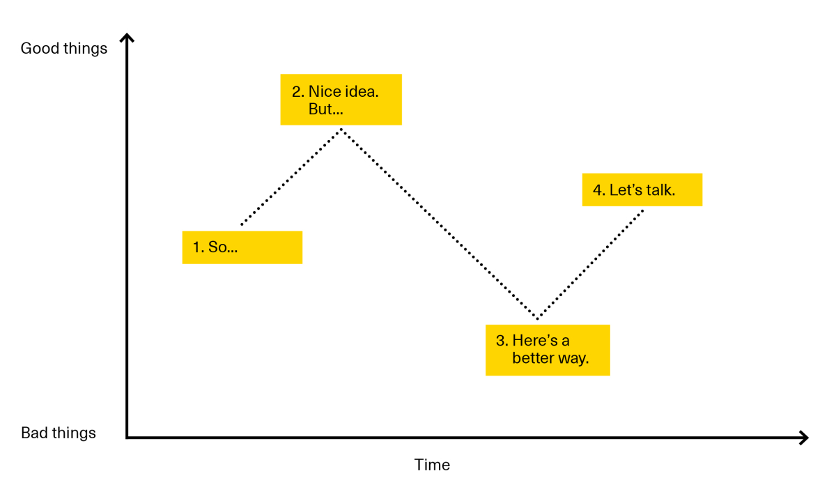
For the sake of simplicity, I limit the number of pivots to two. But the story follows roughly the same path as the one outlined previously (albeit in a significantly simpler way)…
- ..
- Nice idea. But…
- Here’s a better way…
- …let’s talk.
Here it is in action. I’ll use the same brief I used the last time.
- ..you’re thinking of producing content.
- Nice idea. But…when it comes to content marketing – you can’t just wing it. You have to know how to move your audience through your argument.
- Here’s a better way. Use this story arc I’m using right now and your prospects will fly through your funnel.
- Read all about it in this blog post or better yet…let’s talk.
This makes it sound incredibly simple. But I actually plotted this graph based on some of my favorite Velocity work.
In particular, the following film for Iron Mountain (written by Der Kessler and brilliantly brought to life by Sebas and Clim).
The film starts by describing why data protection is so important. At 00:14, we see the ‘nice idea, but’ pivot. At 00:50 we see the ‘better way’ pivot. And finally at 01:10, we earn the right to say the brand’s name.
Cool, right?
Don’t get me wrong, all the charm and pace of this video comes from the brilliant paper work and writing. But the structure behind it sets everything up.
Using this structure
Just in case I haven’t said it enough, let me say it again:
These approaches are just starting points. Every story and piece of content ends up following its own structure – and frankly that’s a good thing. No one benefits from churning out formulaic crap.
But the reason I think these structures are worth considering (and sharing) is because when you’re buried under all the thoughts, ideas, themes and issues that impact any content strategy, it can be incredibly hard to know where to start.
I use these structures to torture test various versions of the brand’s story and get it down to the simplest possible terms:
- Can I figure out what both my client and their prospects will agree is the most important thing here? Is it the industry? Is it the discipline?
- Can I adequately describe both why the old way made sense and why it no longer does?
- Can I articulate in a reasonably interesting manner why our approach is uniquely positioned to solve the issues we’ve described?
- Have I earned the right to start mentioning benefits and introducing myself to the reader?
Invariably, when you try to force a complex story into such a simple structure, there are bits that don’t fit. There are things that need to be said that the structure doesn’t account for. That’s ok. But at least you’ve got the ball rolling and know what the general argument could and should look like.
Because as I said at the start of this thing: structure is crucial.
And if you’re anything like me, structuring content is a pain in your ass. But 100% of the time, once I’ve been able to make the story fit this structure, it’s been worth the agony.
So I hope these approaches and the underlying structure help you wrestle with the undoubtedly complex stories you’re tasked with telling. God knows it’s helped me.
*I use it primarily for slideshares and videos because it lends itself nicely to those formats. They’re usually short, sharp pieces that grab the reader by the hand and confidently deliver some sort of new way of thinking about an old issue. These kinds of pieces call for a lot of pace and a clear trajectory so a little bit of structure goes a long way.
**Stanton’s approach is based on Brian McDonald’s approach (detailed in his excellent book Invisible Ink), which itself was passed down to him from a couple of improv actors.
Header image credit: Rintala Eggertsson Architects

Enjoyed this article?
Take part in the discussion


Comments
Sharjeel Sohaib Allied Inbound Marketing January 10th, 2016
Brilliant Harendra. The approach you’ve shared is simple but powerful.
I write for Alliedc.com/blog and rarely I feel confident that I’ve communicated what I intended to (or what the subject-matter-expert [SME] tried to communicate in an interview).
I have a lot of research data+3rd party content+ SME’s perspective+competitor’s blogs/whitepapers when I do interviews or write-ups but pulling it in a compelling manner was always difficult. So, now I’ve got hold of something I can refer to when doing difficult stuff.
I read Doug’s post’s regularly, but glad that I bumped into your post as well. The way you’ve written it makes it easy to follow.
Harendra Kapur January 11th, 2016
Cheers, Sharjeel!
The hardest part of this job is pulling together all these different perspectives and communicating what’s important and what isn’t.
Glad I could help.