In the first post in this series, we introduced the challenge:
We want to find out everything we can about infographics. And we want to create one that gets one thousand shares.
But before we rise to the heights of data and storytelling complexity (and possibly fall flat on our faces), let’s kick this series off with some basics:
What’s an infographic (and what isn’t)?
There are so many different types of infographics out there, the term doesn’t really say much – just like the word “book” doesn’t really tell you what a book is about or which style it’s written in or how complicated it is or whether you’ll want to read it.
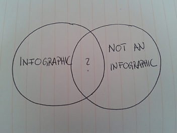
I’ve asked around and found that most people have (often quite specific) ideas about what an infographic should and shouldn’t be. That includes my own, broad definition: It’s simply a format that presents information visually. BUT I don’t think any prettified piece of text (like this primped up bullet list) should be called an infographic (even though it makes a long list very legible). If the visual design doesn’t contribute to making the information more understandable, it’s not an infographic for me. Case closed. (You’re welcome to pick this definition to pieces, of course).
There’s one thing I like even better than prescriptiveness, and that’s discovering all the different things that infographics can be. Which is really quite a lot:
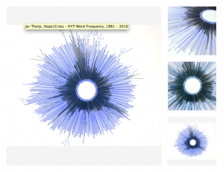
- Giving a shape to Big Data (Like Jer Thorp’s ‘NYT hope vs. crisis’ word frequency count)
- Processes (Flowcharts, Decision trees, that kind of thing. Here’s an example:)
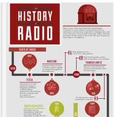
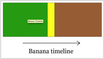
- Timelines (Like “The history of radio”. Also love the banana one)
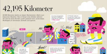
- Stories (Like “What can happen when you run a marathon”)
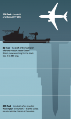
- Relationships (like this excellent one – it really makes you understand how bloody deep the ocean is)
- The state of stuff before-and-after
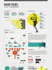
- Aspects around an issue (e.g. Stuff you didn’t know about the NFL)
- Etc. (<– We’re really interested in finding out about this bit!)
Infographics vs. data viz?
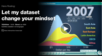
For some reason, I think of infographics as static, without a time dimension. That’s probably because I assume they should be printable (but seriously, who prints stuff these days anymore?). There are excellent examples that show how things develop over time (Like Hans Rosling’s TED talk mentioned above – check it out for a brilliant demonstration on data and disproving preconceived ideas), but I have always thought of them as “data visualisation” rather than infographics.
In the course of writing this, however, I feel that I was wrong – the temporal element isn’t the issue at all. It’s the position of the author: Infographics come from a state of knowledge already attained: they are editorial, crafted, and aim to communicate something their author already knows (and not necessarily data-driven). Data visualisation is the opposite – it’s an instrument for insight, helping to detect patterns and/or irregularities in a system. An infographic is a statement – data visualisation is more of a question.
What makes infographics a tough format?
As a content marketing agency, we tend to do infographics rather than data visualisation. The data discovery and analysis bit usually happens before we come in (let’s face it: no client would pay us to create an infographic without knowing where it’s going – though I suspect it could be great fun for us). And like any other communication format, infographics come with their own rules and issues:
- Convolutedness vs. oversimplification: The general aim is to present information quickly and clearly, pointing to patterns, trends, connections, etc – infographics are meant to reveal, not confuse. And while some infographics go a little overboard on complexity, you don’t want to be too common-sense about visualizing data either. It’s really hard to strike that balance.
- Managing expectations: just like with websites, brochures, ebooks, clients have often seen something they like – and they want something similar. We’ve learned that it’s important to define the message early on – and discuss which types of infographics are suitable to the issue – see the (incomplete) list above. It’s the best way to avoid the disappointment of “this isn’t what I was expecting”. (Also I think some clients secretly expect an infographic to do something totally amazing and unforeseen – when really, they are the ones who are most down with – and least surprised by – their own data and issues)
- Finding out which type of infographic is right for which problem: creating an infographic involves a lot of wrestling with data/processes/issues – and even more trial and error (and that complicates the “managing expectations” bit I mentioned above). Ryan Skinner has attempted a typology of infographic messages: Here’s his post on finding out which shape your data wants to be.
And then how do you create a good one?
I don’t really know yet. Most people (like me) have an instinctive idea about what infographics are and should be – and many (also like me) are surprised to discover how many different types exist out there to challenge that preconception (new examples will probably emerge as the format matures). So all this defining what is and what isn’t an infographic is only partially useful for learning how to get them right, because… we instinctively know when we see a really good one. And we also know immediately if it doesn’t work. So in the next blog post I want to look at some of our favourite examples – and try to get to the bottom of what makes them great. Stay tuned.

Enjoyed this article?
Take part in the discussion






Comments
There are no comments yet for this post. Why not be the first?