We’re big infographics fans so when LinkedIn launched their new LinkedIn Maps tool, we were first in the virtual queue to have a play. The tool generates a colourful, dynamic map showing all your connections and how they’re related to each other. It colour codes the clusters it identifies and lets you assign your own labels to the colours. You can zoom in on specific individuals and see where they fit in your world.
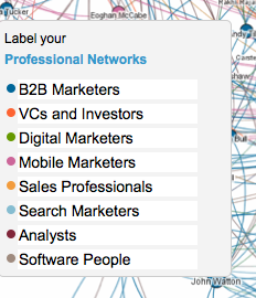
My network was pretty accurately clustered in these groups:
It would be nice if you could embed your map in a web page or blog post. In any case, the share-able version doesn’t let others see the names of the individuals in your cloud. Which is probably a good thing.
Go have a play.
inmaps.linkedinlabs.com

Enjoyed this article?
Take part in the discussion


Comments
Antal Maerrey January 15th, 2015
It looks like InMaps will no longer be supported by LinkedIn after August 2014. What a loss as InMaps was such a great tool to use!