We know we ‘big up’ Pär Almqvist, the Marketing Dude at VNL, quite a bit. But we thought you’d like to see what we consider a really, really good eNewsletter that Pär briefed in and designed (we wrote it for him).
The newsletter does a lot right:
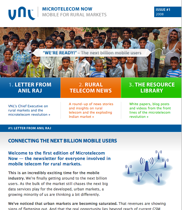
- It’s clear, colourful and inviting – three colour-coded sections; design in the service of content
- It’s about the reader’s concerns not just the company’s –only one short bit is about VNL at all — and they’ve earned the right to smuggle that in
- It’s packed with content – incuding recent industry news items (pre-digested) and links to two videos and two white papers.
- It starts with a nice, personal note from the CEO – giving it a human face
- It’s as long as your arm – nothing wrong with scrolling if there’s a lot to say — and it’s better than reducing the content to a series of cryptic lines.
- It’s a link-fest – driving people to the VNL website; with proper analytics to track the click-throughs
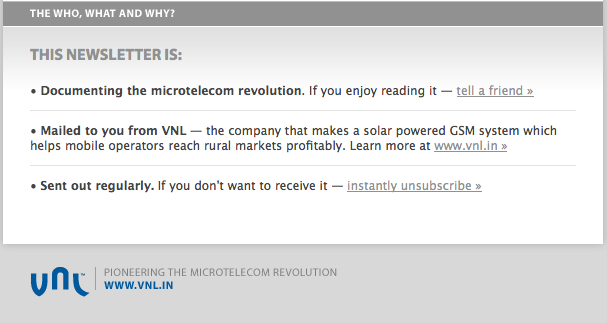
We even like the way the housekeeping is handled at the bottom:
Newsletters are an important string to the B2B marketing bow. We could all do worse than following this one.

Executive Creative Director
Doug is a displaced Yank who started his career at Ogilvy & Mather, New York.

Enjoyed this article?
Take part in the discussion


Comments
There are no comments yet for this post. Why not be the first?