We’ve blogged quite a bit about infographics. (And boy have we argued about them internally).
So given that we all have strong views on what makes a good one, I’ve decided to put an end to the attempt to reconcile the opinions. And instead just let everybody have their say. Easy.
So here’s the roundup of the Velocity creative team’s all-time favourites:
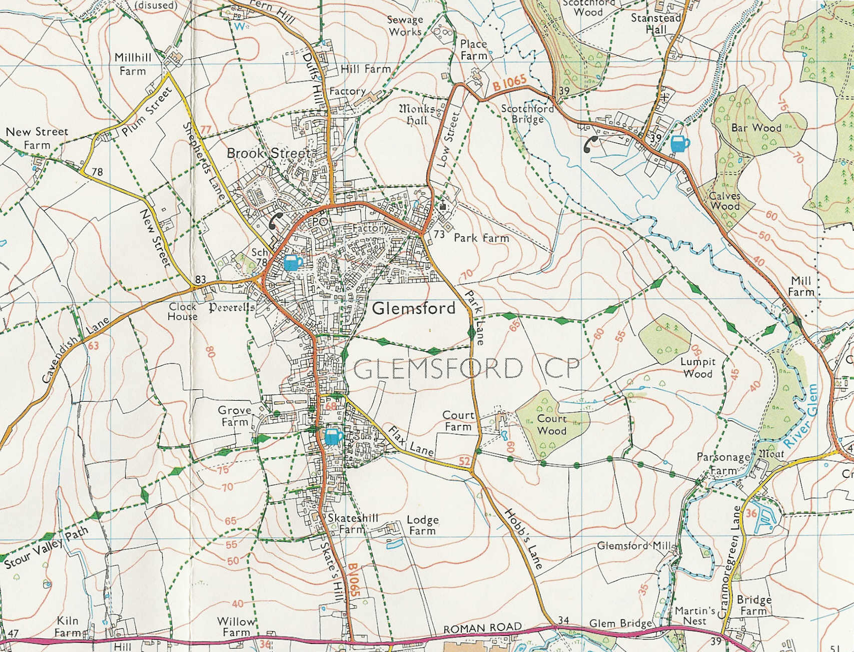
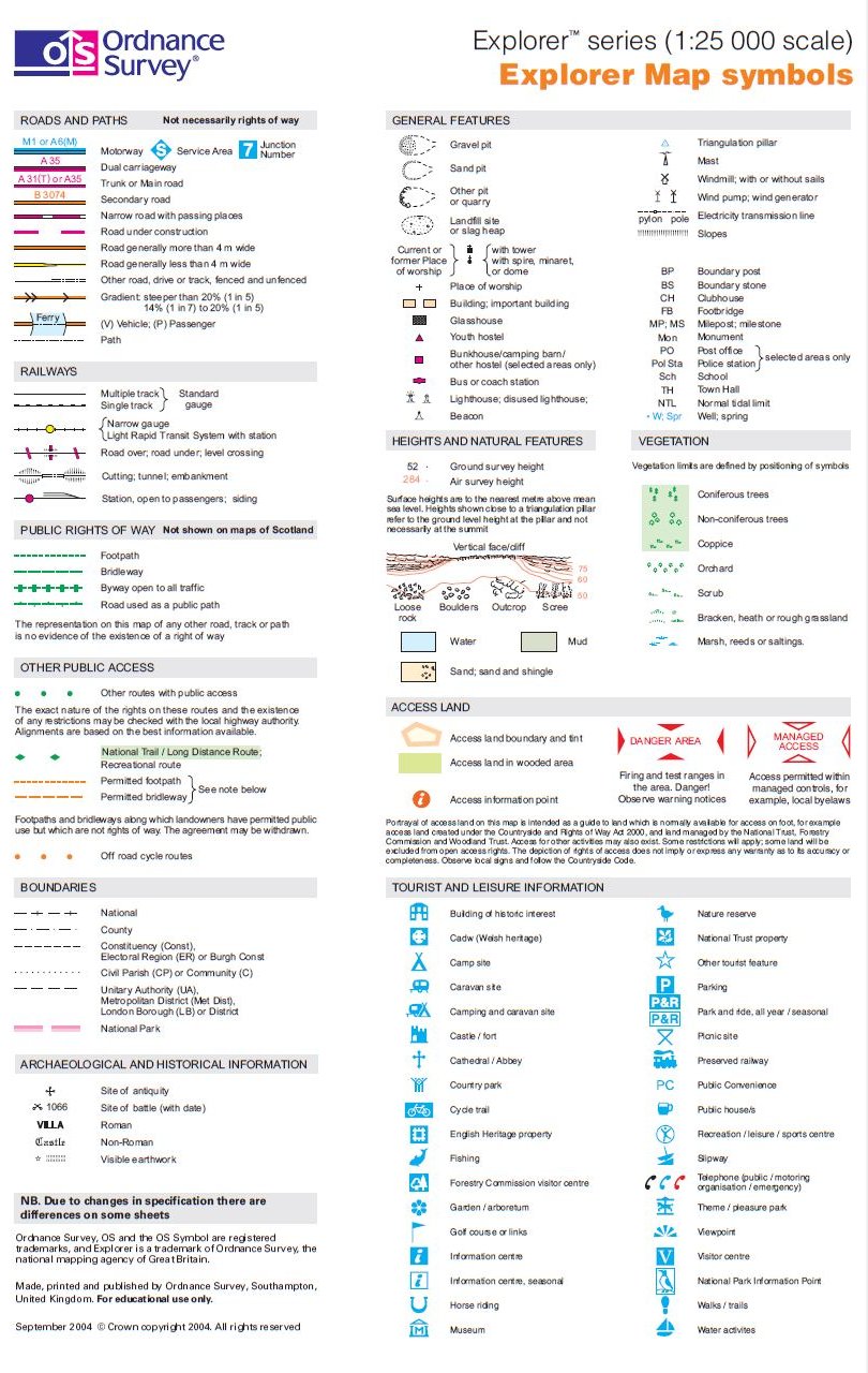
1. Ordnance Survey Maps (Joel)
Joel thinks they’re the greatest infographics of all time because they’re:
– The exact amount of detail and simplicity as they need to be.
– Accurate as a mother-fucker.
– Useful, practical and have been tried and tested over many years.
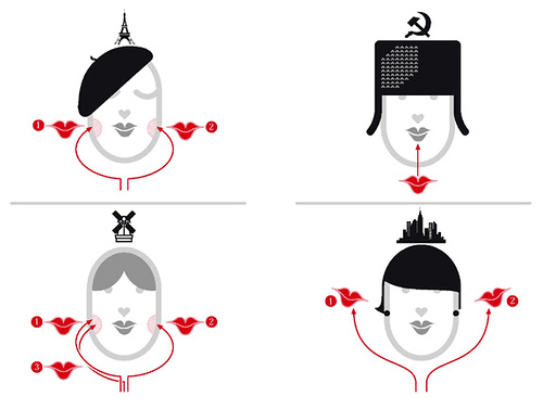
2. How to kiss a stranger (Luis)
Luis went for this example from Nigel Holmes’s Wordless Diagrams: “It’s self-explanatory, informative, precise and above all a charming piece of design that makes you smile.”
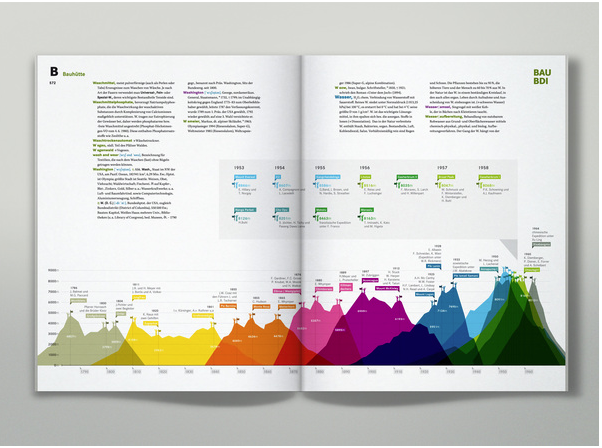
3. Brockhaus encyclopedia (Jude)
Jude chose Martin Oberhäuser’s work for German encyclopedia classic Brockhaus: “I love this person’s work – clear, clean, conveys actual information.”
See more of Oberhäuser’s work here.
4. Tidying Up (Luke)
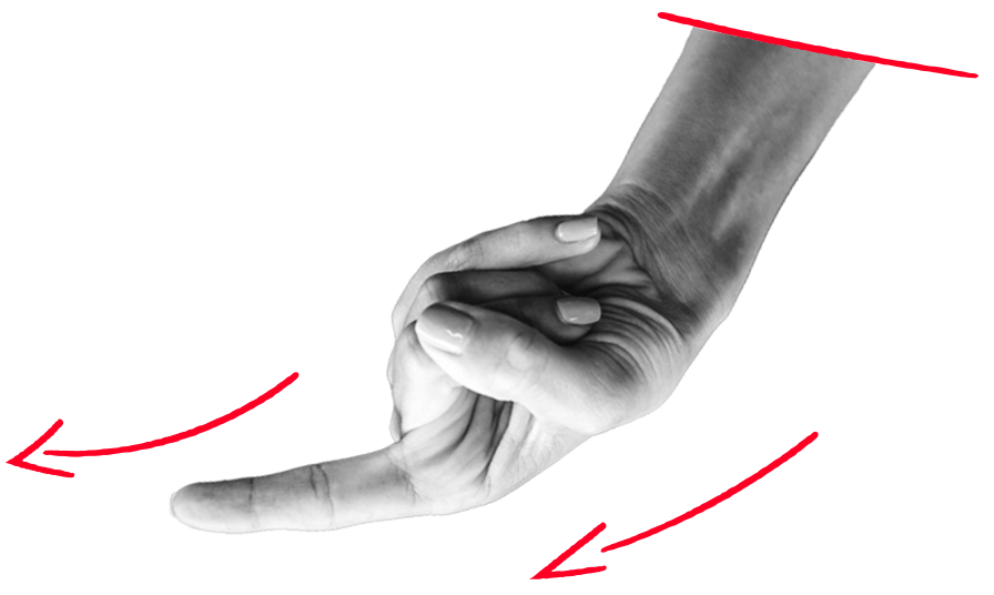
Luke (We miss him! And gone with him is bacon sandwich Friday.) picked this charming example from one of Swiss artist’s Urs Wehrli Tidying Up books.
Maybe not an infographic in the traditional sense, but definitely one in spirit: all about seeing things differently and grasping what you couldn’t have grasped otherwise.
And in Luke’s words:
“I like simple and clear ideas/stories. If they get too complicated I can’t be arsed to work them out! The main thing is content, earn to sell and all that!?!?! Who cares about some stuff!”
5. Napoleon’s Russian campaign (Doug)
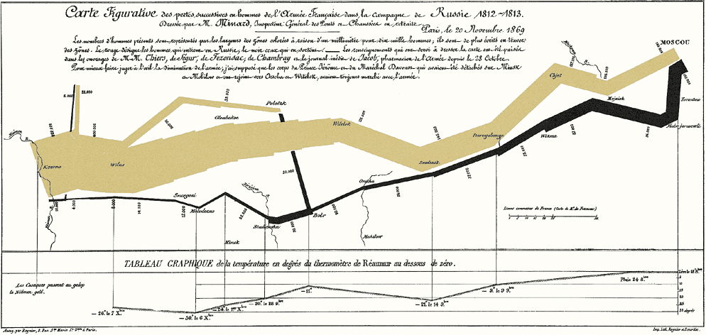
Charles Joseph Minard’s 1869 map of Napoleon’s march to Moscow 1812-1813: Doug’s choice. It’s one of the most famous infographics of all time – and highly esteemed by visualization purist Edward Tufte, whom I’ll quote in lieu of Doug, who’s on holiday:
“Graphical elegance is often found in simplicity of design and complexity of data”.
The width of the brown line represents the size of Napoleon’s army in the course of the campaign (their retreat is drawn in black). It’s mapped in relation to the geography of Russia (note the disastrous crossing at Studienska, which almost halved their numbers).
And it holds other dimensions of data:
- Two brown lines show offshoot expeditions (one of which rejoins the main trek later)
- The bottom chart shows the sub-zero temperatures in the winter of 1812/1813.
By the way, Tufte (not necessarily Doug) also has these ideas about nice-looking infographics, which I wouldn’t want to withhold:
“Attractive displays of statistical information
- have a properly chosen format and design
- use words, numbers, and drawing together
- reflect a balance, a proportion, a sense of relevant scale
- display and accessible complexity of detail
- often have a narrative quality, a story to tell about the data
- are drawn in a professional manner, with the technical details of production done with care
- avoid content-free decoration, including chartjunk.”
6. Birth-day (Ollie)
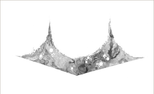
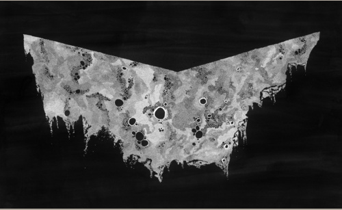
Ollie sent me a link to the work of Sam Winston. In Birth-day, he charts the births and deaths in the world over a 12-hour period.
Ollie loves it because “visually it’s absolutely stunning and as data visualisation goes it tells a story and quantifies the data in a unique way allowing you, the viewer, to make a comparison between the two pieces. It’s thought provoking. Also I cannot believe that it’s hand drawn!”
And also because he met the guy once.
What did we learn from all this?
1) That Jim, Phil, Mel and Analogue are way too busy to look at infographics all day (or maybe they just can’t decide on a favourite).
2) That I need to write more blog posts to showcase all the other amazing material I’ve been sent. (On their way. I promise.)
3) That our creatives love infographics that are
- Charming: unusual solutions (like photographic ones) and unique illustration styles score high.
- Useful: like guides, maps, encyclopedia illustrations, etc. We want to learn something from them.
- Simple and precise. Cute doesn’t rock, and we don’t like overly playful, ornamental stuff (…but are absolutely in awe of multiple dimensions)

Enjoyed this article?
Take part in the discussion







Comments
There are no comments yet for this post. Why not be the first?