Make no mistake, usability is very, very important to the success of your web site. A poorly constructed site is a curse for the type of people you’re trying to communicate with (knowledge workers, ‘C’ types and senior managers – all of whom are busy people).
 Download this B2B Technology Marketing White Paper in pdf Format
Usability is often the critical difference between a 10-second visit and a ten minute accompanied by a download, registration or purchase. Without it, you’ll find that your site becomes too ‘bouncy,’ and not ‘sticky’ enough to do what it’s supposed to do.
Usability is extremely under-valued and badly practiced in B2B environments. A lot more energy goes into creating good looking web sites than high performing web sites. This is probably because many B2B companies are still in a ‘brochureware’ mindset when it comes to the web. But to ignore usability at the outset of a web design project is folly – especially since it’s done so incredibly well elsewhere.
By taking a handful of pages from agenda-setting B2C e-commerce sites, this paper looks at why usability is critical to your success, how to build it in to your site at source, and how to test that it’s serving your commercial goals. It also takes in a number of case studies to illustrate best practices – from sites such as Amazon and Salesforce.com.
In our estimation, designing for usability is a must. It’s also easy to do if you start with it as a goal.
But why is it so important? Here are the facts:
- Once it’s built, your web site needs to perform like an Olympic athlete to grab your users’ attention. You will be competing against Manchester United and Scarlett Johannson for their attention, not the competition next door.
So you need to be compelling.
- It’s likely that at least 50% of users will arrive via your back door rather than your home page as a result of search activity. (Google has a lot to answer for!)
So you need to meet their expectations fast, across every page.
- When they arrive, the vast majority of users won’t know you, trust you, or care for you. Their only assumption is that there’s a slim chance that you’re relevant to their needs… because Google told them so – but you’re just one click away from the ‘other’ 25,678,963 sites related to their search term.
So you need to breed confidence.
- Contrary to popular wisdom, they won’t scan your page in any logical sequence (we’re given to assume that the eye zig-zags down a page). Nope, the pupil does a crazy dance in a nanosecond and your first impression will be made.
So you need to capture their attention.
- In addition, they’ll see your site like Mr Magoo. No sweeping panoramic views here (after all, they’re late for a meeting and their phone’s ringing). Just a squint. Then their mind’s made up.
So you need to channel their focus.
- If they do stick around then they’ll probably just wade in and muddle on through. No clean click paths, just a muddle. Whatever works to get them from A to B – usually via Z, F and M (in that order). If they make a purchase or sign up for stuff at the end of this process then it’s all credit to them, not you.
So you need to be simple to navigate.
The point is that, setting aside your functional and design ambitions, you absolutely do not have a common user to create a beautiful web site for. Instead, you have a schizoid, multi-limbed, mythical creature who’s only consistent attribute is that she’s in a darn big hurry.
What you need is a set of tools that will help non-technical people (including designers) and non-design-literate people (including technicians) create web pages that serve equally your corporate objectives and your user requirements.
A tough challenge, right? Well, not exactly. It’s all rather obvious – but a decent set of descriptive tools can help to ground us in the real, rather than the conceptual. So here’s our guide to web usability…
Clapham Junction: A Case Study
Usability (and it’s close relative Accessibility) is not a new discipline. In more established areas of design it’s a standard practice – so much so that good usability either goes without notice or is simply an expected part of an experience or a service.
An example is our rail network here in the UK. Although criticized for dubious service levels (anyone for ‘leaves on the track’ causing delays!?) they do have one thing nailed. The in-station user experience is pretty tight. So much so, I don’t really need to talk to any staff to get to where I need to be. All guidance information is rendered via a standard string of signs…deep blue and white, with a neat set of icons to supplement the verbiage.
Here’s the view from Clapham Junction in rush hour: a truly crazy place in need of good user experiences.

OK, so…. I just got off a delayed service from the South Coast and I’ve got to change to get to Richmond. But shoot, the connection leaves in under five minutes. Heeeeelp!?
What platform do I need? Oh…
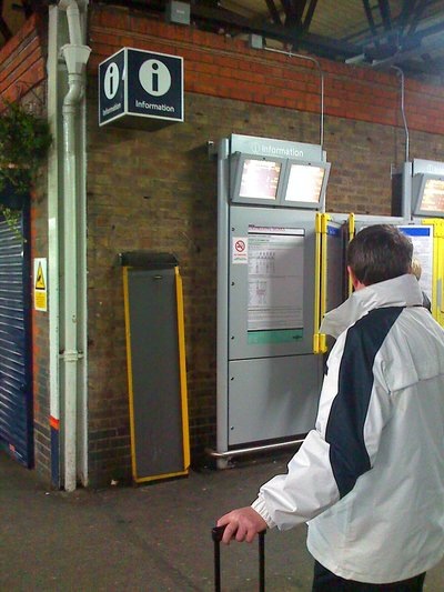
And how do I get to my platform? Ah…
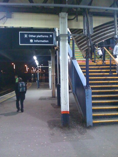
Is this the right one? Yup…
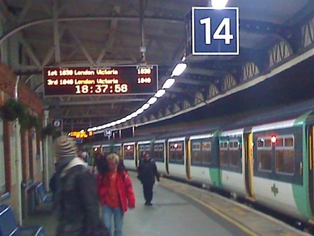
Sweet. Got there with a minute to spare, and only one punch-up in the corridor!
Some concepts to consider: Signposts. Visibility. Legibility. Colour. Fonts. Language. Supporting imagery. Utility.
Taken as a whole, how well does your web site use these things?
In general, the web scores badly on usability and providing great experiences. When it comes to the trade-off between your own objectives and that of your users there’s usually friction. And since the web tends to be viewed as one big advertising property, corporate concerns often win hands down – resulting in a site that bludgeons with branding, messaging and widgets but provides very little in the way of tools to help users do the things that really matter: buy, sign up, find a contact number.
Why is this?
Unlike Clapham Junction, the majority of web sites are built by companies that are unaccustomed to crowds. Instead, they’re built by people who are used to dealing with customers one by one – usually via a real, live salesperson – and with the benefit of time and space to hold hands and help customers orientate themselves in their insular world of products, services and protocols.
As such, good examples of usability and customer experiences on the web are usually found in industries where the heritage is self-service or the business itself has been invented online. – ie, B2C firms. So let’s see if we can steal some general rules from their playbook…
Rule 1: Designing Layouts for Sameness but Difference
Being the ‘same but different’ will capture your users’ attention and channel their focus.
A common mistake in web design is to aspire to difference for difference’s sake. Being ‘brand new’ is beneficial in the sense that it sets you apart from your competition, but it’s counterproductive if it means people can’t use your site. Think about this for a moment. A refreshingly different navigation scheme may amuse you and your team, but you have one up on your average user – you’re motivated to care (thanks to your salary). Visitors to your site will feel less enthused. You have a nanosecond of their attention, so you don’t want to make them work too hard.
An online newspaper provides a good example. Since news is now a commodity online, users are spoiled for destinations but lacking in patience as a result – it’s just too easy to skip to another source.
Here’s an average ‘news hunting’ user experience: I search for ‘social networking’ in Google, and I click on a link. It takes me to the Guardian’s site. Let’s see how it handles things:
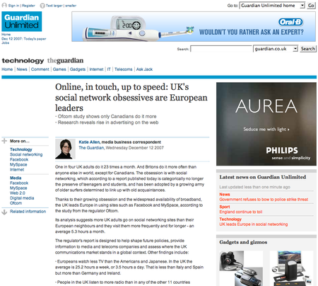
Looks interesting. Nice and clean and easy to read. OK, good article. Now I want to find out what’s going on in the wider world. Let’s hit the home page and browse around:
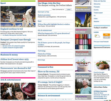
I find I can immediately ground myself in a bunch of different content types, perspectives and potential navigation paths. Without losing any sense of order, everything seems to be beautifully in place. This is a great example of how to use visual hierarchies to guide users.
I want to preview business stories: easy. The site gives me a clear and immediate view of content types. Each editorial section has a horizontal rule above its header. ‘Business & money’ in blue, ‘Sport’ in green and so on. Special features are pulled out in the third column with the help of an image for each one: their header also matches the colour code for the section they live in, so I can tell that ‘Life and Style: Sew Ethical’ belongs in the ‘Arts & Entertainment’ section (they’re both coded pink). The fourth column is given over to ‘push’ style content – it’s either functional (eg, weather and navigation links) or advertising-led (eg, ‘Sponsored features’).
This presentation makes my navigation choices easy. I can see at a glance that news stories live in columns one and two, and I can quickly see how they’re collated. If I want to get a deeper read, then column three looks promising, and if I’m feeling easily distracted then I know that column four is going to take me away into an unrelated content area or off-site to an external world of an advertiser (although in the most subtle of ways – no anger-inducing Flash banners). I could easily close the browser and jot down this organizational scheme on my notepad from memory. It’s intuitive.
This is because, aside from visual hierarchies, the page has been designed with a strong sense of order via the use of structured grids for different types of content. Four columns: elongated cells in the first two for bigger content chunks, smaller cells in the final two for snappy content nuggets. My eye is quickly assimilated into a precise way of evaluating content – and nothing on the page breaks these rules. For example, as mentioned, they’ve forgone the use of any intrusive advertising, which is often found nested uncomfortably in the middle of news or magazine-style sites. Instead, ads are moved off to the right hand side of the page, and each maintains the integrity of the core site design: fonts, colours, header rules, etc are all seemingly governed by a consistent style guide, when this page space could easily have been sold off to the highest bidder in whatever format the advertiser pleased.
Now let’s click through to a sub-page – ‘Business & news’…
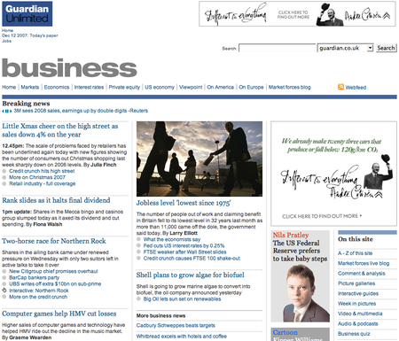
Eerily, the page seems the same, only slightly different. The four columns remain – two for news stories with longer content cells; one for features, with thumbnail pictures and one for additional links. There’s an ad, but it’s where I’d expect it to be, to the right of the page, and not too distracting in terms of colours. But the main page header bar’s a different colour – it’s blue rather than the home page red. But that’s OK because the corresponding ‘business’ section snippet on the home page was framed by a blue bar. Everything seems to knit together seamlessly.
This sub-page must have been a piece of cake for the designers to produce: repetition and stability is the order of the day – there’s nothing here that needs ‘re-orientation’ after the home page experience, and so my choices are made even easier as I’m drawn further in to the site’s layout conventions. In addition, although the site is extremely content-heavy, the pages feel light. All of the content is easy to read due to the general removal of noise and clutter. And if you think this is a no-brainer, then think again. Here’s the Evening Standard’s current home page (…who’s in charge here guys, the design team or the sales team!!??):
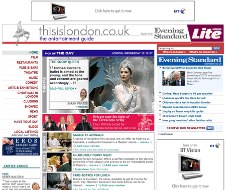
Some Best Practice Layout Guidelines for Usability
- Establish a strong presentation hierarchy organized around different types of content assets (eg, ‘news’, ‘articles’, ‘features’) and stick to it
- Use colour – and/or icons – to denote different content categories
- Remove all clutter: don’t let non-core content compete on the page
- Establish a visual grid and don’t break it
- Make content hierarchies and labeling schemes persistent across the site
- Make your design templates repetitive (but not boring!) to provide stability for your users
Rule 2: Respect Established Navigation Conventions
If you can follow established design conventions you’ll breed confidence in your users and you’ll make your site infinitely easier to navigate.
Let’s say I’m searching for a Christmas present for my niece. I know she loves the ‘Sopranos’ and that the final DVD of the sixth series is just out. Let’s go find it…
Here’s what HMV gives me on a simple search.
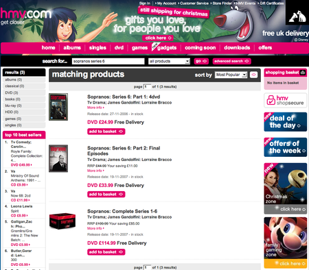
Bingo. But then I remember that my sister’s already bought her this, so I change tack. It has to be the new Roisin Murphy album instead. But, how to find it?
Great navigation breeds confidence and successful visits (cash buys, subscription paths, etc) because it acts as my only guide in what’s usually an alien territory (your web site).
When I land on your page via a Google search, unless you’re a mega-brand with an image that’s already been burned into my brain, then nothing’s going to prepare me for what I see aside from the snippet of text that sits below the Google link. So I arrive stone cold – aside from the expectations that I bring with me.
As such, if I’m searching for a DVD, then the chances are that I’ve been to an e-commerce site before – probably Amazon. Although I have no experience of your site (indeed, this is the first time I can remember using HMV), here’s what I’d like to see:
i) A strongly categorized primary navigation bar

Check. See also the neat highlighting and arrowing motif they’ve used (we’re ‘on’ DVD).
ii) A set of ‘breadcrumbs’ that tell me how to wander back out of the alleyway that I’m in and onto a higher level…

Check. Excellent. I know exactly where I am in the wider context of the site. This is map reading 101!
iii) A secondary level navigation of sub-categories (probably rendered on the vertical)…

Check. Wow, they’ve used that handing highlighting / arrow motif again. Thanks!
iv) A free(form) search tool – probably enabling me to search by product category…
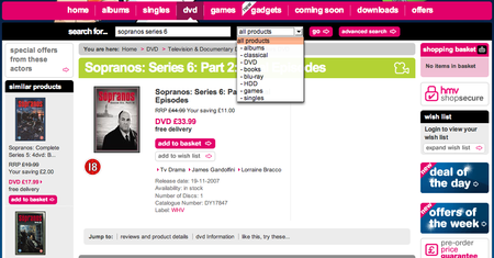
Check. I feel good about searching here: because it’s categorized I know that the results I’ll get won’t be a firehose of irrelevant stuff.
Great. Now, despite the fact that I don’t know this web site, with these things in hand, I’m confident I could get around and find Ms Murphy.
Let’s compare this experience with Amazon….
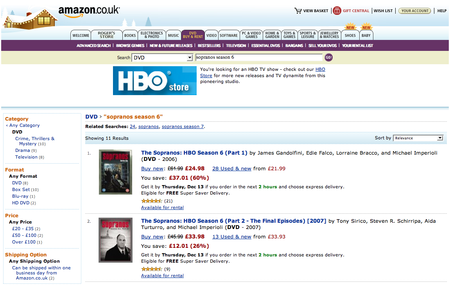
Aside from a different way of doing breadcrumbs, these sites are practically identical in terms of navigational functionality. Why? Well, no doubt HMV is getting its butt kicked by Amazon… so it’s following Amazon’s lead in terms of design. Is this a good thing? Not necessarily if you’re Amazon (although it’s a sincere form of flattery), but absolutely if you’re HMV.
By paying respect to dominant conventions that have been set by others, HMV is improving its chances of competing for my cash. In simple terms, I feel comfortable in this environment because I don’t need learn any new navigational techniques to traverse the site. All of my preferred cues are present. I feel grounded and, although it’s new to me, there’s nothing to throw me off track (proof: I know I can get to Roisin Murphy in a few clicks before I start trying to find her).
But let’s have a look at an area where the sites differ. It hints at why Amazon is so successful.
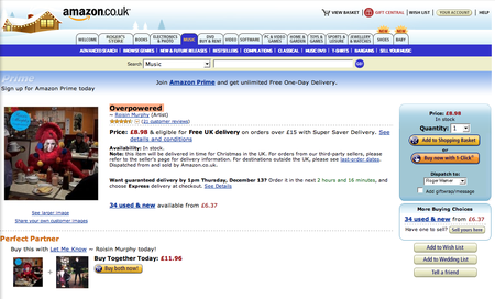
So, I’m going to by Roisin Murphy’s ‘Overpowered’. I’ve clicked through to the relevant page (in double quick time!). Here’s what Amazon gives me:
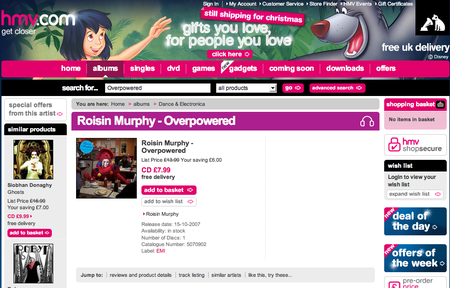
And here’s the same page on HMV:
The bake-off:
- Amazon’s good conventions: “the customer’s about to buy something – let’s get any navigation and extraneous content the hell out of the way!”
- HMV’s not-so-good conventions: “the customer’s about to buy something – let’s keep all the surrounding navigation and content consistent so we don’t confuse him!”
- The difference: I’ll bet my house Amazon converts far more customers to a sale than HMV.
Amazon is smarter because at this point there’s only three actions that matter: ‘Add to Shopping Basket’, ‘Buy now with 1-Click’ or the ‘Buy both now’ offer. To this end, they’ve embedded them as buttons. No rocket science there, right? But take a look at the HMV page. How many things look like buttons here? ‘Deal of the Day’? ‘Offers of the Week’? ‘Great Savings on Forthcoming DVD Releases’? ‘Add to Basket’? ….and how many of them lead to a purchase of the album?
This is a great example of how blind dedication to navigational conventions can be counter-productive. Excuse the pun, but I’m overpowered by the number of options calling for my attention on HMV’s page. When you have a user where you want them, you need to bet that their intentions are in line with yours -in this instance on the sale/purchase. So don’t hedge and give them the choice to move elsewhere within the site – just make it easy to complete the task at hand.
Rule 3: Trustworthiness – Prove You Care with Words
Great content will ensure your users stick with you. The right words will help you to establish trust and ultimately draw them in to a deeper relationship with your site.
Remember I mentioned that – contrary to conventional wisdom – many of your users won’t arrive at your site via the home page? Well, let’s establish a rule: most of your site users don’t know you.
Is this a problem? In terms of marketing, no, far from it – it’s what every sales and marketing guy dreams of: shaking hands with a bunch of unknown people with a one-time opportunity to turn them into a bona fide lead. But in terms of usability it is because you need to do a quick job of convincing them to stick around.
Let’s look at this from a user’s point of view. I’m a sales manager looking to improve my team’s performance. I search for a popular type of software app that I know will help – a CRM (Customer Relationship Management) tool. I click on the first link (of a zillion) that I get because it feels good…
Here’s what I get:
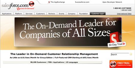
We’ve already talked about navigation cues and content hierarchies and how these things can help to calm the nerves and ground the user. Salesforce.com does all these things perfectly. But what’s really eating at me is the following question: “OK, so I’ve got a real need for CRM and a zillion links to choose from. My time is short. Why should I spend my time with you!?”
Once you have your audience, you really need to convince them that you’re the one. This is done through words. Let’s see how Salesforce.com manages it…
When I hit the home page I’m greeted with the headline ‘The Leader in On-Demand Customer Relationship Management.’ Huzzah! I’m not quite sure what ‘on demand’ means, but I know I’ve landed at the right place. What else? Ah ‘Full-Featured CRM Starting at $65/User/Month.’ Wow! This quest may be easier than first imagined.
OK, so, it’s got me. Let’s have a scout around. To the left we have a little vertical bar that seems to list some products or services (there’s some natty little icons). What’s this all about…?
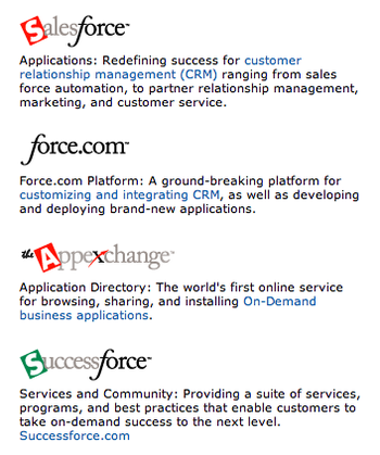
Let’s zoom in on the blue text here. ‘Customer relationship management (CRM)’; ‘customizing and integrating CRM.’ OK, I’m definitely in CRM heaven. I might go back and have a play with those links later.
But what about the rest of the site? Towards the base of the page we have some clean navigation elements…

I’m not sure what the button refers to… some kind of ‘no software’ campaign? We’ll let that one slide for now. But what’s this: a whole section ‘About CRM’? Perfect. Ah, and a page describing ‘What is on-demand?’ That’ll help. Also I can see some stuff on CRM best practices and some success stories. I feel very, very good about my search choice now.
And there’s more. At the very bottom of the page, there’s a whole bunch of navigation that’s kind of twinkling at me. Let’s take a closer look:

Wow – that’s all about CRM. OK, I’m on board. Now, where to go first?
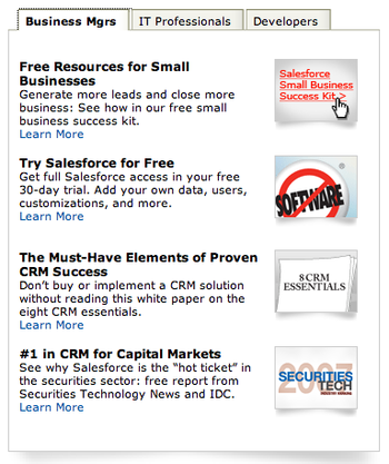
In the middle of this page we have a useful piece of ‘demographic’ navigation that presents a bunch of links relative to who I am. Now, forgive me for gushing, but his company really seems to care about me. OK, so I’m a business manager of a small-ish firm. They have a small business success kit. Let’s go browse that…
Of course, my journey here is highly idealized but the methods used by Salesforce.com are 100% sound. Through sensitive use of labels, link titles, headlines, and navigation techniques, they’ve grounded me in an instant. The approach is like a conversation with a great salesman – a series of small but salient words that nudge and cajole me along into a deeper relationship with the site.
Let’s look at them again:
- Trust adjuster #1: Use a descriptive headline in a banner (or strapline under your logo) to tell the uninitiated user exactly who you are. If you’re upfront about this you’ll snare the people you want and drive away the time wasters.
- Trust adjuster #2: Use your descriptive copy in your key navigation – primary and secondary. This will further consolidate your validity.
- Trust adjuster #3: Use your descriptive copy in all key links on the page. If the page has been styled right, then these will be rendered in a different colour to the rest of the body text, and so they’ll leap off the page.
- Trust adjuster #4: Where possible, make your navigation personal. Find ways of segmenting your content so that you can help users navigate in a way that’s meaningful to their life rather than yours. And pepper this navigation with your descriptive copy.
- Summary: to establish trust on a first visit you need to pay lavish attention to your copy. It’s what you say and how you say it that counts.
The flip side of this is that all of the above is GREAT practice for search engine optimization (SEO). With SEO, the job is essentially the same: you need to convince Google et al that you’re relevant to a search query. With SEO, however, the thing you need to impress is a piece of software (a ‘spider’ that crawls your site) rather than a human being. The good news is that they tend to read a web page in much the same way as we do. They’ll get to know you through your language and how you use it. So, to encourage Google to categorise you properly, you need to deploy keywords in strategic parts of your pages – headers, subheads, links, bold text, footers, etc. There are variations on this theme that will help, but that’s pretty much it in a nutshell. (Although if you’re interested in the science, then we recommend you read our paper on SEO.)
How to Test for Usability Before Making Public Commitments
OK, so that’s how you design and write for usability. The next section will help you to plan your work before you commit anything to code (an hence save you money!).
If you’re managing a web site project of any scale or importance (and let’s face it, they all are), then planning for good usability is a non-trivial task. How confident are you of making the right navigational choices for an average user that doesn’t exist? Right, me too! So this is where we get testy.
The idea of usability testing usually conjures up images of iris scanning, men in white coats and lengthy bills. But it doesn’t need to be this way.
Usability Testing on a Budget
Let’s take a step back here. What do we want to achieve through testing?
We want to…
- Generate ideas on how our content should be organized
This should be done at the earliest possible point in the planning
- Stress test your pages before they’re committed to code
This should be done at the same time you’re creating page designs, so you can give the designer a semi-concrete site map to build her creative ideas upon
- Try out our site on the uninitiated (ie, the ‘average’ user, fresh from a Google search) before it goes live
This should be done as soon as the site is built – ie, in ‘Alpha’ mode, but not yet public
Here’s how we do these things cost-effectively…
Generating ideas on how to organize your content
This is an easy one. It involves a bunch of Post-it notes, some address cards and a couple of colleagues.
Firstly, gather a couple of members of your project team in your boardroom and brainstorm a list of every single piece of content and every user service (eg, a search tool, a web form, a shopping cart) that you want to see in the new site. Make this exercise sub-atomic: get as much detail as possible – no piece of content is too small. Resist the temptation to bring order to any of this, just dump it all out on a flip chart.
Secondly, transcribe this ‘brain dump’ list onto Post-it notes, one piece of content per note. Place the pile of notes on the conference table (again, unordered). Then play a game of organizing. In turn, each of you picks up a note and sticks it on the wall in groupings that you debate and construct as you go. So, I pick ‘Press release’ first and stick it up. Dave picks up ‘White paper’. We discuss and decide they’d go well together because we have a hunch we’re going to need a ‘Resources’ section. When you’re finished, you should have a rough site map. Go home and sleep on it (remembering to tell the cleaner not to remove the Post-its!) and then review and edit it the next day. When you’re happy with it take a photo of your newly-decorated wall.
Finally, to test your thinking with a wider audience, tear the Post-its down and recreate just the primary level of your map on the wall. Then invite a couple of colleagues who are not on the project team to pick up Post-its at random and place them within your meta-structure as they see fit (like pinning the tail on a donkey, only without the blindfold). Take notes as they do this – they’ll be full of questions and you’ll want to ask them stuff too. Why did they put press releases in the ‘About us’ section? … and so on.
Once you’ve been through this exercise you ought to have a good grasp of how to organize your content. The next step is to commit this to a real site map. You can use a natty drawing application for this, or Powerpoint or Word. Whatever, the important thing is that it’s clear.
Stress testing your pages before they’re committed to code
At this stage, your site is ready to go into full design mode. Your designer has been briefed and now you have a site map to give to her. As a next step in the creative process you should ask her to produce some wireframes – at least one per section, plus a couple for your most critical pages (eg, buy stuff, sign up for something, etc).
(Wireframes are line diagrams of page layouts. They’re not designs, they’re just rough concepts to inform the direction that a design may take and the functions of key pages. As such, your designer ought to be happy to create them as they will simplify her design process.)
Keep in mind that your goal is to keep the build process on track and within budget, so your aim is to eliminate any nasty surprises ahead. As a piece of collateral, wireframes are great for this. As well as focusing the design effort, they’ll help your implementation team to code effectively. They’ll show people where on the page a form should be placed, how a button should be rendered and so forth. Wireframes make your build process less woolly.
But they’re also great because they’ll give you something to test. To do this, grab some colleagues to act as guinea pigs. Let’s say you have a collection of six wireframes to play with – one for the homepage, one for the products page, one for the search page, etc. Your job is to hand them out and ask your test team to do a couple of imaginary tasks, like ‘go fetch the latest press release’, ‘go send me a message’, and ‘find our contact number.’
Obviously, these actions are hypothetical, but the important thing is to talk as you go – get your testers to give you a stream-of-consciousness commentary on what they are doing as they mentally maneuver around the pages, and at the same time pepper them with questions about what they’re doing. At the end of this process you’ll have a far stronger idea about how well your pages will perform. If you’re unhappy, then change stuff. Then freeze the wireframes and get your designers and implementers to crack on.
Try out a working site on the uninitiated
The next step is to test a working version of your site. This is best done at the ‘Alpha’ stage before launch, whilst you still have time to make improvements.
What does this involve? Well, it’s pretty much the same as your wireframe tests, only with a working site. Facilities-wise you’ll need some more colleagues, a couple of PC’s, a quiet room and a notepad. The goal is to ask people to do some pre-conceived (important) tasks, have them talk through the process, ask questions and then compare results. You need to learn why Mike took a different route to signing up for a white paper than Shelley, and then extrapolate some lessons. Can we make the paths any easier? Did the guys suggest new ways? Did they do what we asked them to in unexpected ways? Is it worth applying any new logic to the site?
And that’s it: usability testing on a budget.
Conclusion: Think Like a Nutter, Make Like a Magpie
It’s funny. The best user experiences are the hardest to create. It takes a slightly manic and enquiring mind to care about and cater for the myriad ways that people will interact with your web site.
When all’s said and done, you can’t afford to make assumptions – there is no average user to design for. Rather, it helps to think around the issues like a nutty, schizophrenic half-wit who’s never used a computer before. Because if you can make your site work for this person then it really ought to work for everybody else.
A tough challenge? I hope so, or at least I hope you don’t fit this profile!
Difficult it may be, but at the same time there’s comfort to be found in crowds. You’re not the first person to take on this challenge. It’s likely that your competitors will have already overcome similar problems, and other firms in other marketplaces will have established some good usability conventions. So don’t reinvent the wheel.
Life’s too short – just follow their lead and – like HMV – make like a magpie and borrow a little. Your users will thank you for it!

Enjoyed this article?
Take part in the discussion




Comments
B2Bstones October 28th, 2008
Nice! B2B web sites are more popular than before with the development of EC. ~~
Miracle Mind Method PDF September 12th, 2013
Serious question – if you know a certain
technique which works on women, would you feel nervous being around one.
However, many people with heinous intentions employ
hypnosis mind control for getting confidential information of others.
Now, whether there is a coordinated grand conspiracy at the top (e.
www7a.biglobe.ne.jp August 23rd, 2014
Look for refundable policy, abc especially if they had a financial plan and make sure you never have a higher deductible health plan may
be used to send to Mr.
agar io free hack,agar.io hack cydia,agar.io hack bot features,agario hack bot download,agario cheats iphone,agar.io hack android apk,agario skins mod mobile,agario hack bot no survey,agar io skins android,agario cheats chrome,agario skins iphone,agar.io Massey AG December 4th, 2015
We routinely update the list using recent plus working mistakes
but still advise you to use hack into as it functions always for
virtually any browse plus account.
samsung firmware update Lawrence and Oquinn Consulting August 28th, 2016
I called Samsung support sadly only after a week of my
warranty expiring.