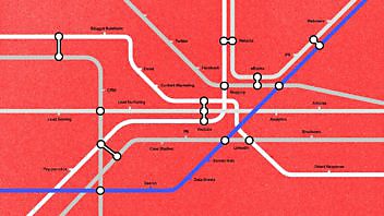

We’ve always loved Harry Beck’s legendary design for the London Underground Tube Map, so thought we’d do our own version mapping out the B2B marketing landscape. Kind of makes sense if you give it some time. The junctions were the trickiest bits…
Hats off to Simon Patterson, whose brilliant ‘Great Bear’ piece inspired this.
Check out the definitive boook on Harry Beck’s map, by Ken Garland.
And there’s a great History of London Tube Maps here.

Executive Creative Director
Doug is a displaced Yank who started his career at Ogilvy & Mather, New York.

Enjoyed this article?
Take part in the discussion


Comments
Kim Cornwall Malseed October 19th, 2009
What a creative, fun and useful visual! I particularly like the stop for ‘pray’ 🙂 Great work!
seamus walsh October 21st, 2009
Very Nice! Every tube map I have seen has a central station, something to fall back on. If you launch too many with out a content strategy you are going to need a hope and a prayer stop.
Mohit Bhakuni October 23rd, 2009
Indeed very interesting way of presenting B2B marketing. However, I need some help in reading it properly. There are central stations like Content Marketing, PR, Search, which makes sense. Then there are trains that connect stations, e.g. blue train (connecting Analyst, Media Relations, PR, YouTube, Email, etc.) which is also beautifully done. But how to read the sub-urban stations like Spam, Prayer, etc. Does this map imply that Flash Demos, Brouchers and Case Studies are as less likely to work as Spam and Prayer?
Doug Kessler October 23rd, 2009
Good points — in our experience, case studies work best when combined with prayer into an integrated campaign. Spam is next to prayer because their both faith-based.