We never tire of building websites. The sheer pace of technology change means we constantly push the barriers back. No two projects are ever the same.
But the excitement is tempered with dread of the same old arguments.
Major web projects have huge internal visibility. Good web tools deliver bonuses and people, unsurprisingly, demand them but, more surprisingly, want to help build them.
It’s bizarre. We don’t feel qualified to build cars just because we drive them. We rely on Ferrari to do fast, reliable and beautiful cars.
Opinions can cause havoc with project scope, timescales and budgets. That’s why the Top Ten Mistakes of Web Management, despite being over a decade old, remains relevant. Readers can learn why strong project management is as important to web usability as cutting-edge design.
Two of the ten points stand out.
Never design for your executives. Internally-focused sites brim with mission statements, photos of the CEO, and corporate history. You are not the centre of your customers’ universe. Top executives grow to love a customer-focused site because it delivers.
Never design for your org chart. Users should not be able to deduce your organisational structure from your website. Build sites according to tasks users want to perform on your site. Nothing else matters.
B2B marketing agencies work best with clients who bring a strong, autonomous project management structure with tunnel vision on their users.
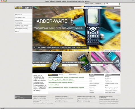
That’s why we loved building Psion Teklogix’s new site. Todd, Marcos, Maria and Roman channelled every ounce of our energy into research, mapping, design and testing based only on user personas.
If you want to know how to get the best from your agency you could do worse than talk to them. They did such a good job of shielding us, we still don’t know how they did it. But we know they did.


Enjoyed this article?
Take part in the discussion


Comments
There are no comments yet for this post. Why not be the first?