
Signal Noise on information design and agile project management
Signal Noise is the kind of agency whose work ups the bar for the rest of the world. They specialise in information and interface design and are the smart minds and brilliant designers behind such projects as The Guardian Ryder Cup Interactive, the Plonk app and exhibitions such as Less than a Second and The Art of the Algorithm. (They’re near Old Street, where all the London innovation hangs out, if it’s not in Richmond. Like Analogue Dave).
Some time last year (a lot longer ago than I care to admit this has taken me to publish) I met up with three smart people from Signal Noise: Emma (Account Manager), Hem (Account Director and Co-founder), and Christian (Co-founder and Creative Director) – to talk information design, keeping clients happy, and how to avoid exploding project scopes.
Can you give me some background on Signal Noise and talk a little about how you started out?
[Christian] After my master’s in communication design, one of my first jobs was for a corporate consulting company. They’d get us creatives in on business meetings, to sit in and understand what they were talking about – which was mostly acronyms – and then summarize the discussion in one visual. We did this four 4 years. Hem and I shared an office – that’s how Signal Noise started, along with Matt. A lot of it was self-taught.
What did you learn from this first experience?
Mostly that if you know your subject matter inside out, you’ll design it in a way that’s too complex. As outside observers, we managed to give our clients a fresh perspective and the distance they needed.
Emma, as an account manager, I assume you’ve got to do a lot of expectation management early on…
Yes, but it’s become easier to get clients to understand what will come out of it. A few years ago, we had to educate them on what infographics can and should do: Who are you doing it for, what do you want readers to take away, what’s the story we’re trying to tell, what’s the right way to do that, etc. We had to help around what end of the spectrum it was – narrative, data-heavy, fun, scientific, etc.
Do clients accept your advice readily?
[Hem] They do, and they expect that guidance from us. We always ask “If someone looked at this for ten seconds, what’s the main thing you’d want them to take away?” That’s our job, whether we do it through design, tone, or content.
[Emma] Managing expectations is really important. Our clients need to understand what we can achieve with their data. We guide them as best we can when we create the story. Sometimes we ask for more data, such as a breakdown by year or by sector. Other times we get too much data that we can’t possibly get across. Our job is to challenge what we’re presented with.
Does it ever happen that the story clients want to tell isn’t really the one they have?
[Emma] Information design is extremely revealing. The visual format shows you the data holes where things don’t quite join up. But we haven’t had that problem a lot.
What’s the most difficult bit of the client relationship?
This may sound hard to believe, but it’s not that difficult anymore. We’ve got agile processes for working with our clients and do a lot of basic work upfront to get an understanding of the key messages and the tone for the piece. These conversations and sketching the wireframes really helps us before we start visualizing things.
Tell me a little more about your agile process for information design.
Getting the content defined upfront saves us a lot of time, and cements the scope. Next is the wireframe stage, which is for discussion, moving things around, changing them. When you’re past that stage, you really want to be sure about your message. We advise clients when to show it to their key decision makers, because changes at a later stage will be time-consuming and expensive.
[Hem] It’s part of a collaborative process that characterizes the whole project. Some agencies will take a brief and when they’re done, present the final piece, with no communication in between. We want to keep everyone in the loop right from the kickoff process.
[Christian] On the simpler projects, we don’t present lots of options. Some agencies always give you three options. We want to give clients the right one. We’re specialised, and they trust us on this. If we didn’t believe in our solution, we wouldn’t send it off.
Are clients happy with that agile process?
We ask slightly more of them, but it pays off with a better result. Also, the more engaged the client is in the process, the more they’ll care about the project.
Have you got an example of one project where the agile process has really helped you?
[Emma] Definitely on our bigger, technical projects. For EE, we created a big tool with lots of features. We started out with a wishlist, where everyone got to say what they’d like the tool to do. That’s usually a bit of a post-it fiasco. Then, people vote these features into categories: priorities, nice-to-have, etc.
Next is design. Once we go into build, we work with a prioritised list of features. And we’ve got dates when we revisit the initial needs and tweak the build accordingly. For instance, you might realize you don’t need that toggle button there, but you do need some analytics. It’s all about the flexibility, giving clients a chance to move things around.
— Signal Noise’s web usage tool for EE—
[Hem] That project was great. They came in originally not really knowing what we were looking to do in the kickoff, but it really made it tangible for them and made them take ownership, as well as us. It bonds you with the client, and you can also pin them down on any decisions.
What do you think is the next big thing in terms of information design?
[Christian] The past years were all about showing complexity. We saw a lot of really beautiful overwhelming images, showing off that we have the data. But the problem with complexity is that we can’t really read it. I think we’re going back to simplicity. When you think about wearables, it’s pretty much a single digit at a certain point in time. I think that’s the direction that information design will go.
Check out more work from Signal Noise.
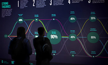
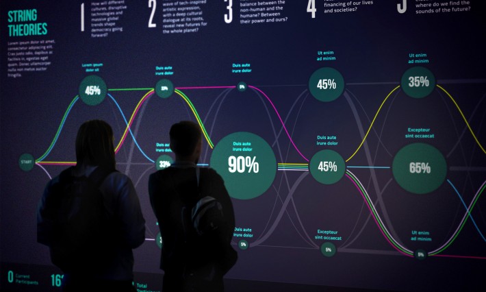
Also, Signal Noise is sponsoring FutureFest 2015, “a weekend of immersive experiences, compelling performances and radical speakers” (March 14/15 at Vinopolis in London). A fantastic lineup, including Vivienne Westwood and George Clinton. Do check it out if you’re around. I will.

Enjoyed this article?
Take part in the discussion


Comments
There are no comments yet for this post. Why not be the first?