Big results from small interactions
MADE.com (RIP) made my life better. If you’ve ever bought furniture online, you know that when it finally appears at your door, it’s invariably smaller, less special, or (worst of all) looks like it belongs in someone else’s home.
But, MADE.com had an app with an AR feature, that realistically visualized how a bookcase I wanted would fit in my living room (next to my favorite Hoji frog art print and the yellow mid-century modern chair I thrifted). Now, everyone who visits thinks I got the bookcase custom made for the reading nook. Like I’m Goop or something.
Why am I telling you this?
Because interactivity is both insanely powerful and routinely underutilized. And while big, showstopping interactive experiences (like MADE.com’s AR tool) get all the press, there are a ton of small, inventive and inexpensive ways to use interactivity across your existing content that measurably improve engagement.
In this post, we’ll cover:
- Why interactivity works
- Interactivity that won’t cost your whole quarterly budget
- An alternative to a PDF
- An alternative to a grader
- An alternative to a webinar
- Two rules for great interactive content
So, let’s start unpacking how to inject more interactivity into your marketing (and why that can happen in more places than you think).
Why interactivity works
Interactivity is a proven engagement-booster that turns users from readers to participants.
According to a study by Demand Gen Report, interactive content was more effective at educating buyers than static content by 23%. And according to Gitnux, interactive content gets 4-5x more pageviews on average compared to static content and drives a whopping 61% conversion rate on average.
The problem is so many marketers only take big swings with interactivity—reserving it for expensive, showstopping content experiences (like the MADE.com tool). There’s a universe of potential for smaller kinds of interactivity throughout everything digital you make.
Interactivity that doesn’t cost your whole quarterly budget
Let’s be real: you probably don’t need to build an AR tool. But you can use interactivity to drive engagement in far more scenarios than you realize. Here are some ways you could weave more interactivity into the digital experiences you provide:
An alternative to a PDF
So you’ve just finished the content for a killer ebook. Insights galore, hot-takes aplenty. And then you turn it into a PDF to make sure no-one ever reads it. Ugh.
Let’s all just agree PDFs are bo-ring. They’re restrictive, they’re static, and you can’t measure how people read them (or whether they read them at all). And no one really wants to download them. You know what’s exciting? Interactivity.
Take all that great content and turn it into an animated long page instead. Animated long pages are great—a totally blank canvas to design whatever experience you want, with all the bells, whistles and polish you can think of (or afford), AND they’re so easy to track—you can see where people go, how long they lingered, what they interacted with and so on.
Here’s an animated long page we created for Quantexa.
Here’s what makes it interactive: the chapter buttons on the top-left. Start your animated long page with a clear structure—a table of contents with some kind of jump-down navigation.
For example, if your page is on Car Insurance for Self-Driving Vehicles, create a chapter on increasing insurance premiums so your readers can quickly get right to the information they care most about. It’s the simplest thing—but helping users self-direct to the most relevant content massively increases their chances of actually reading what you have to say (and, ideally, doing what you want them to do).
The other cool thing about animated long pages is that they allow you to combine text, illustrations, animations, video, and all the interactive bits you need to present your content in the most engaging way possible.
It’s also very search-friendly. It’s clearly marked up to optimize around the keyphrase/topic, allowing you to own the topic.
An alternative to a benchmark report
Maybe you want to pull a benchmark report together because you want to help your prospects measure their performance against industry standards or competitors. Great idea!
Here’s the thing though: benchmark reports are hard to make. First of all, you need a whole bunch of market data (either paid for or proprietary), and second, you’re effectively giving it away for free.
Instead, we recommend a grader: a survey-like experience that invites users to build out the benchmark dataset itself—while also providing dynamic insights and recommendations based on user responses.
Here’s one we did for QA—a leading tech trainer and talent services provider aiming to help UK businesses emerge from the pandemic stronger and more agile. We made a “Custom Resilience Report” that helped users assess their ability to embrace digital, adapt to change and close the digital skills gap.
We asked users questions about remote working, automation, cloud maturity, recruitment, training and so on, scoring their responses against categories like “ability to adapt” and “effort to digitize”.
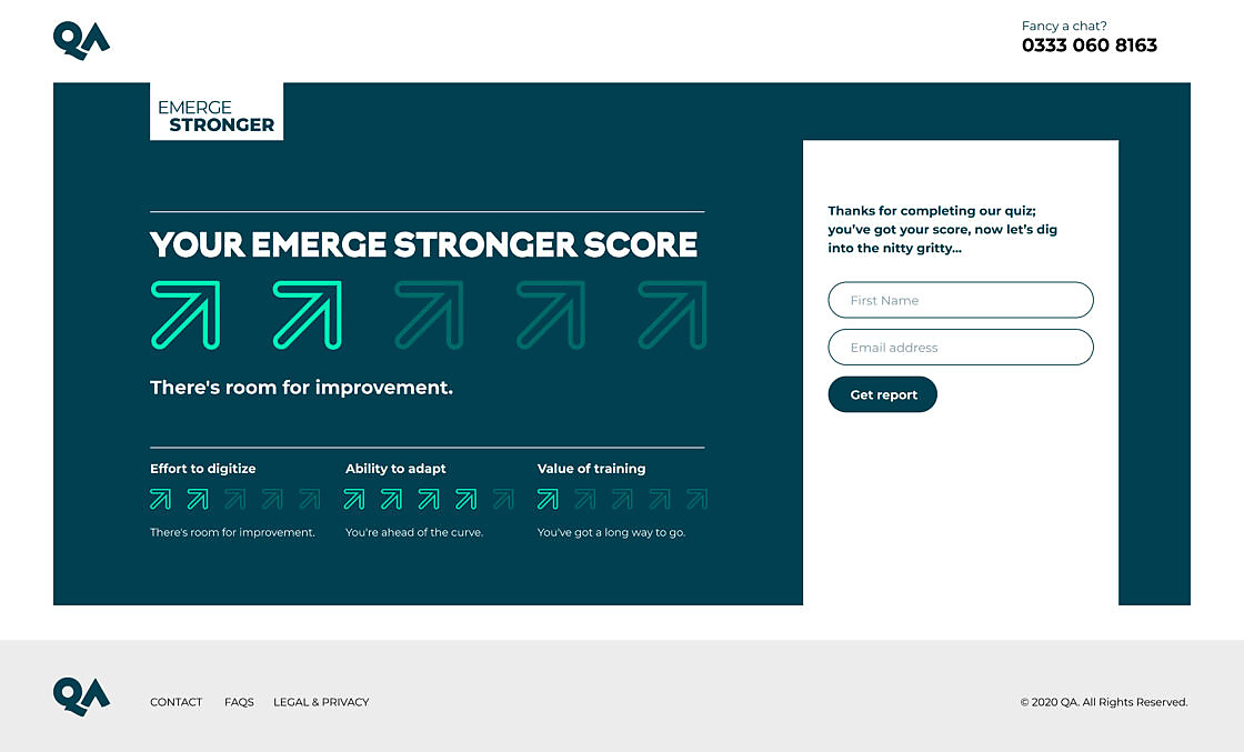
After the grader, users got:
- A score across each category and high level summary of their performance
- A deep-dive report that provides tailored insights and recommendations
- Customized content recommendations that address challenges implied by user scores
That amounts to a lot of custom content. But that’s the price of non-linear interactivity—if you’re asking users to commit to a 5-minute content experience, you have to reward that engagement with useful and relevant insights.
Here’s a peek behind the curtain of the kind of planning it takes to provide the dynamic responses that auto-populate the deep-dive report.
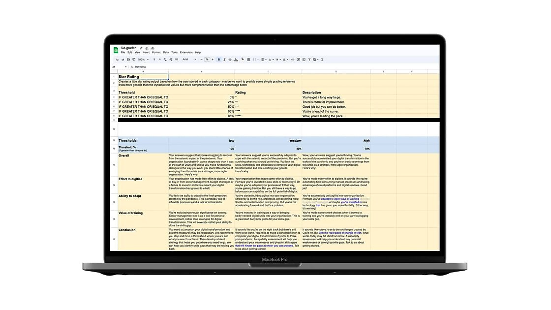
But the juice is worth the squeeze—while a benchmark report asks users to guess how their performance compares to peers and industry averages, graders invite them to actively quantify things (while also capturing a bunch of insights your sales teams can use to accelerate hyper targeted conversations).
And from a design perspective, there are also so many opportunities to fill the grader with small pieces of interactivity that reward users for progressing through a 5-10 min quiz. Our designers have created little UX rewards (cute lil animations when you click on stuff) to send a signal of a premium, polished, dynamic experience.
Try QA’s grader for yourself here
An alternative to a webinar
Once upon a time, you didn’t need to coax people into signing up for webinars—they were excited. It was a novel format to learn from experts, thought leaders and interesting practitioners.
But today, audiences have been marketed at to oblivion. Webinar fatigue is real. So instead of pleading with your prospects to tune in, turn all that useful content into an interactive video series instead.
An interactive video series creates a flow around the topic you’re covering. All you have to do is chunk up the content you already have and present it in a slick hub—to help users find what they’re looking for and suggest helpful, relevant next steps based on predefined content journeys.
It means your customers can get straight to the parts they’re interested in instead of sitting through stuff they don’t care about (which confusingly makes them look more engaged than they are).
We’ve used this mechanism to help users self-direct to the most relevant information during onboarding, or when looking for social proof (like case studies). But you can track user behavior across content hubs to understand what prospective buyers might want to solve or achieve with your product—and invest more in that area.
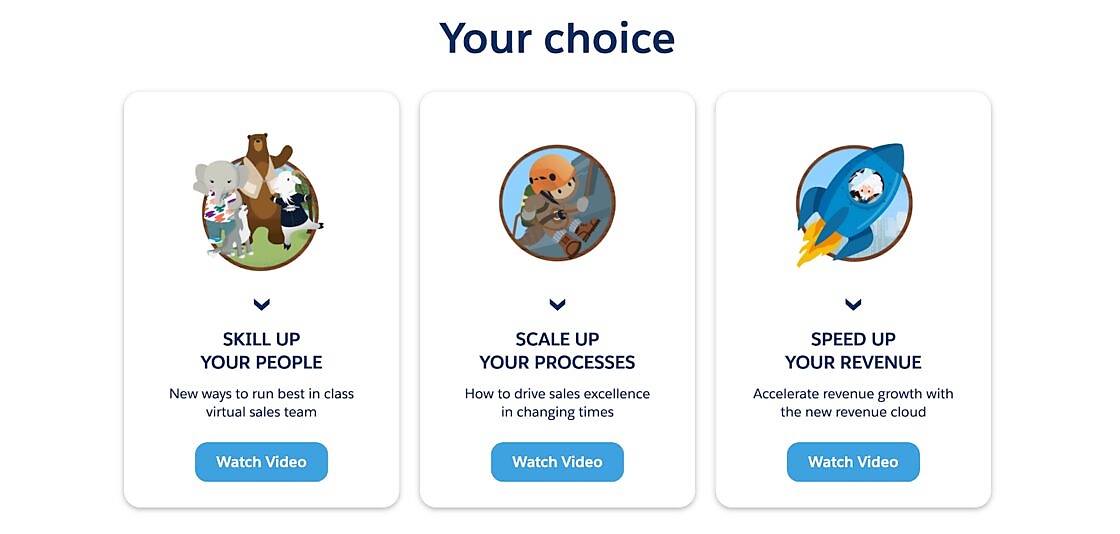
Here’s an interactive video series we created for Salesforce.
Salesforce wanted to present new survey findings and demonstrate how its platform could support its audience in three key ways.
At the end of an intro video about key market changes, Salesforce directed users to choose between people, processes, or profit. This choice helped users get right to the most relevant content quickly. For example, an HR management might have gone through Route A and disregarded the rest.
We mapped out the three journeys like this, allowing room for the user’s experience to change based on their decisions:
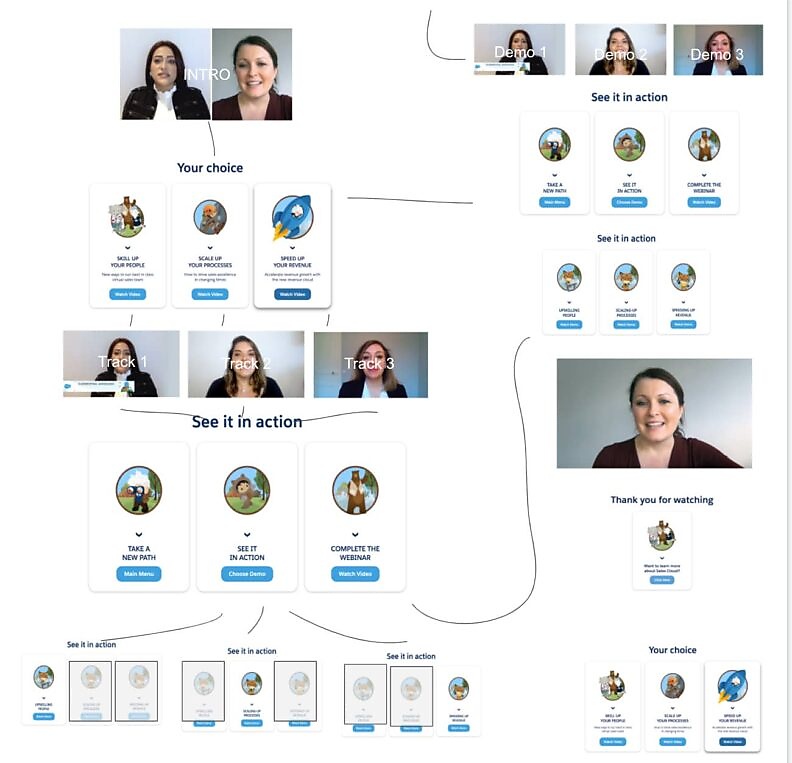
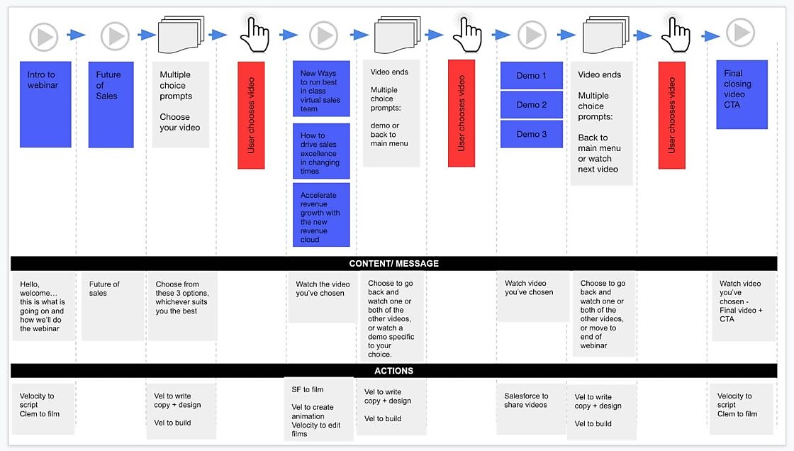
The results were kind of crazy—we saw 80% viewer retention across all videos. Simply empowering people with the choice of what to watch made the experience feel less like they were being lectured at and more like a self-directed learning journey. A huge win for what otherwise might have been just another webinar.
Two rules for great interactive content
Interactive stories are obviously more fun to tell (I am always trying to shoehorn a branded video game into a content plan). But, sadly, this isn’t about us. Like all good marketing, it’s about getting users to take action.
So, here’s what we think makes great interactive marketing content: purpose and non-linearity.
Rule #1: Great interactive content is purposeful
The best interactive experiences aren’t just dynamic—they help users solve a problem, meet a need or fulfill a desire.
I love the MADE.com tool because it solved the worst problem in the furniture buying process in a way only a practical experience could achieve.
What’s the mismatched furniture problem in your buyer’s journey? Is it visualizing the abstract problem you solve in an interactive format? Or is it building a slimmed-down demo version of your tool to give users a taste without committing to a trial? Maybe it’s an ROI calculator or a competitor comparison tool to build a business case.
You can make any humdrum content experience interactive. But the really killer use-cases are the problems that only interactivity can solve.
Rule #2: Great interactive content is non-linear
Why? Because user choices don’t matter with linear interactivity. It’s not a dynamic experience—it’s an on-rails sequence with a foregone conclusion. And when users figure that out, they bail, fast.
Conversely, users love it when the experience changes around their actions and decisions (like in a quiz or a grader or a game). That kind of customization is what gives the user a sense of ownership and involvement, making the experience more personal.
The obvious catch is that non-linear interactivity is usually harder to make. It can be simple—say if you’re just building some fancy navigation for a chapterized long page.
But more ambitious non-linear interactivity often involves mapping out multiple potential journeys, anticipating how different actions impact each other, and creating a range of outcomes that feel like logical conclusions to the actions users take.
Leaving room for exploration
There are so many cool ways to tell your brand story or share your product demo. But interactive content isn’t just about breaking up the monotony of passive content consumption with surprisingly delightful illustrations and adorable animations (although that stuff is precision engineered by smart designers to boost engagement too).
Interactivity is about solving problems for your audience. It’s about keeping them invested in your message, allowing them to explore and interact with what you have to offer based on their preferences, needs, and challenges. The customizations you create will build a sense of relevance and increase the likelihood of retaining the user’s attention. And, most importantly, it will be much easier to convert engaged users into leads or sales opportunities.
So, what are you waiting for? Start thinking outside the box and make that calculator/content series/choose-your-adventure tool you’ve always wanted to. We believe in you.

Enjoyed this article?
Take part in the discussion


Comments
There are no comments yet for this post. Why not be the first?