Yes, there are good infographics and bad infographics. But, more importantly, there are different kinds of good infographics.
Infographics are popping up like mushrooms in the autumnal content marketing forest. Some infographics are large and rich. Others spindly. Some truly bizarre. Others a psychedelic freak-out. (There are probably a few poisonous ones, too).
We’ve done a few that we’re quite proud of. This story is about the process behind an infographic in the B2B content marketing context. Where do you start? How do you frame the story? What will look good?
The first crossroads is a vital one: Does your story start with data, or end with data or steer clear of data altogether? Neither is correct, but you should be conscious of the route you’re taking.
A data-driven story
You start by analyzing data – either your own data, purchased data or publicly available data. Within that data, you look for interesting trends or correlations. OKCupid are masters of this kind of infographic. The beauty of this approach: You are more likely to arrive at original, counterintuitive insights to illustrate. But you’d better have some time, and hopefully some business intelligence or visualization software to hand.
A story supported by data
You start with a hypothesis – hopefully one you’ve got a hunch can be supported by data. Based on this hypothesis, you search for data that supports your theory. Oftentimes, as your search for data demonstrates the kind of evidence that’s available and what it tells you, your hypothesis gets more refined. This is what I call the “English Term Paper” approach. It can be done well, but it’s more often than not relatively banal and poorly supported. Probably 50% of infographics fall into this bucket.
A story bereft of data
You start with a visual idea or just a narrative, and go from there. These are basically what we used to call diagrams or sketches. As they don’t provide any data, they stand or fall on the merit of the idea and the visualization. The Eloqua Content Grid is a good example of this kind of infographic. There’s not really any data, just the sense of tremendous experience and a wise perspective.
Once you’ve decided how your infographic will relate to data and evidence, you should consider what I call your “infographic angle of attack”. Is your infographic very explicitly commercial (will it hard sell your product or service)? Is your infographic based on your own data? Is it based on purchased data? Will it be based on data you create (yes, you can do this legitimately)?
The Taxonomy of Infographic Angles of Attack
The cut and dry PR infographic
I call this the PR infographic because it’s the one most often flogged by PR agencies. They base their ideas from trends in the media, gather their data from third-party sources and present a story that puts their client or its products in a good light. It doesn’t sell a product hard, which lends them greater credibility. But they are usually startlingly unoriginal in terms of the basic story. They tell you what you already knew – if in a colorful way.
Examples:
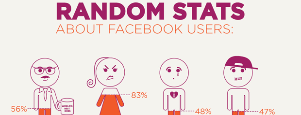
The Facebook infographic (a dime a dozen: if you’re a digital agency and you haven’t made one of these, you’re nobody. NOBODY!)

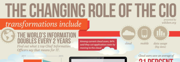
The CIO infographic (relatively random concatenation of more or less interesting factoids with graphic sauce)
The product-centric infographic
A classic string in the marketing agency bow, these kinds of infographics provide a visual take on a product’s key benefits. Basically, these are often glorified diagrams, presenting the world in a way that reflects well on the product and company behind it. These can provide great context for a company and its product, and tell its story in a way 10,000 times more compelling than a deck. But great viral material they are not.
Examples:
The own-data infographic
Done well, this is an angle of attack to love. It’s the apex of content marketing greatness, but demanding as hell. You start by taking a deep dive into your company’s own data, draw out some interesting and original trends revealed by the data and present them in a compelling way. It doesn’t have to sell your company; it sells your (access to) insight. And it’s viral like the sniffles in a nursery.
Examples:
Shutterstock Global Design Trends (Shares both sexy figures for Shutterstock and some interesting facts)
Experimental data visualization
This requires some brio. You start with an assumption, and then build an experiment or survey that will create data, which you then illustrate. These can be a lot of fun, but require some boldness (basically, you have to be pretty confident of the kinds of results you’ll see, or risk wasting time and effort).
Examples:
Hotels.com’s survey of romantic getaways (couldn’t lose in the run up to Valentine’s Day, no matter how banal the data)
The worldview infographic
These kinds of infographics aren’t necessarily data-driven, but can include research (original or no). You basically present information or ideas in a visual way to support a way of seeing the world. If they are directly hinged to your business, then your fans will like it. If they are less hinged on your business, they’re probably more likely to get distributed outside of your circle of fans.
Examples:
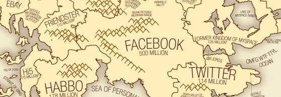
Flowtown’s 2010 Social Networking Map (a humorous – if inaccurate – social geography lesson)
Rackspace “What Type of Site Do You Want to Host?” (and which kind of storage should you choose…)
Do you have any other kinds of infographics to add to this taxonomy?
[Extra bonus infographic: “The Anatomy of an Agency” – No relation to Velocity whatsoever]

Enjoyed this article?
Take part in the discussion


Comments
Doug Kessler February 22nd, 2012
Great taxonomy — how about this one for Salesforce Social Success:
http://www.salesforce.com/uk/socialsuccess/social-media/six-principles-of-social-powered-enterprise.jsp
A no-data infographic — but a good one!
[Disclaimer: A velocity project]