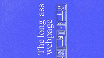
Check out this new landing page for Econsultancy, the digital marketing publisher, community, analyst house, training company and event organiser (whew). We’re students of landing pages and, when there’s a lot to say, we like them loooooooong.
The project name inside Econsultancy was LALP for ‘Long-Ass Landing Page (or Long-Arse for the Brits among us) and boy does it live up to its name. The page is over 400cm deep, which is longer than the wheelbase of a firetruck, taller than the average totem pole and higher than Neil standing on Stan’s shoulders.
It’s got six bright red calls-to-action after every chunk of text. It’s got two videos, 36 member logos, ten testimonial quotes and twelve bright, green tickmarks. It’s written in a fairly hard-sell tone but with a few winks to keep it within the Econsultancy brand voice.
Why did we want to go all long-ass on this one? Partly because Econsultancy has a hell of a lot to tell prospective members – and there was nowhere where all this value was stacked up for all to see. But mainly because we studied a lot of landing pages (especially membership-focused ones) and believe it will sell more memberships. The idea is to test everything, so this hunch won’t be a hunch for much longer.
Here’s the page in all it’s glory, but to actually read it, you’ll have to visit the real thing. While you’re at it, become a member of Econsultancy – it will be the best career investment you ever make.


Enjoyed this article?
Take part in the discussion


Comments
Jeff Ogden March 30th, 2011
Aptly named, Doug., It’s well-designed – clean layout, nice graphics. But it is very, very long. Too long, I think.
Doug Kessler March 30th, 2011
You may well be right, Jeff — bring on the test!
BTW Conversion Rate Experts has an excellent post on encouraging users to scroll. They say that long landing pages tend to out-perform short ones but only if they’re successful in getting people to scroll:
http://www.conversion-rate-experts.com/scrolling-tips/#comment-3167
Ashley Friedlein March 30th, 2011
We’re very shortly to change the Pricing and Plans page (the one which the LALP links to) and when we’ve done that, and got some decent data, we plan to publish a case study, similar to http://www.conversion-rate-experts.com/seomoz-case-study/, showing what we achieved (or didn’t!) with this approach.
One thing that is already interesting to see is that you’d expect the funnel / customer journey to be homepage > LALP > Pricing and Plans… However, currently more people go directly to the pricing and plans page than via the LALP. And that’s because remarkably few people even see our homepage (most traffic comes in to the blog) and our navigation allows them to jump straight to the money page! So all our lovely persuasive copy is often being bypassed… but we have some cunning plans…
Paul Kenny March 30th, 2011
Ashley, back when I was a greenhorn, I used to pour TLC and far too much time into lovingly-articulated proposals. Then I realised that prospects simply headed for the prices page, and that they were prepared to pay that price on the basis of the value I’d generated in the dialogue up to that point, not on the content of the proposal.
Different world, different interface, I know, but you need people to digest the content of the LALP and perceive value before they go to the pricing and plans page, don’t you? So good luck with your cunning plans.
I look forward to seeing what your case study reveals. Accepting Doug’s comments on long landing pages providing higher conversion rates, I’ve not been a fan of them to date. They smack too much of ‘and another thing’ for my taste and I lose interest – but I must admit, the Econsultancy LALP did encourage me to read on, and on.
dan barker March 30th, 2011
when I saw the LALP, my first thought was: “Wow, that’s a bit close to the SEOMoz one”.
My second thought was: “Actually I think this may miss why the SEOMoz one worked”.
I’m very interested in seeing the the cunning plans & the case study, & look forward to being proved wrong!
Rob Kingston March 30th, 2011
@Dan – that’s exactly what I was thinking too… Personally, I’d try tightening up the copy and making sure the subsequent pricing page ties in all those great benefits you mention on the page before.
Regardless, nice work Doug! I think you’re onto a winner here – are you testing it at the moment?
billymitchell1 March 31st, 2011
It played wonderfully on my iPad. A smooth scroll of visual stimuli. I kept going because I kept liking it.
I believe majority of readers will do the same.
Jeff Miller March 31st, 2011
Sorry – don’t like it. Let the metrics prove otherwise…
altteam March 31st, 2011
I’m really not sure that it is convenient for eyes. But if readers like it,,,why not.
simon March 31st, 2011
Too long in my book, but definitely worth testing. In fact, everything should be tested.
Whilst I acknowledge that there’s a lot of important content there, surely a simple bit of navigation would make it just as easy for people to find the bits you want to tell them.
Anyway, test away!
Doug Kessler March 31st, 2011
Thanks, all. Let the testing begin. Ashley & co will report on the entire exercise on the Econsultancy blog once the Pricing & Plans page goes live.
Dan, I should have credited the SEOmoz lander done by Conversion rate Experts as a main source of learning for us. We looked at lots and lots of landing pages but the SEOmoz LALP was the only one that actually made us sign up!
I’d be interested to know where you think we missed the point. We’re all keen to tweak and test as we go.
With such a huge story to tell, the challenge is to find out, over time, just how much to say, in what order and at what stage.
While everyone wants to maximise conversions off of the LALP, for many the conversion process for Econsultancy will probably always be a long cycle. People will experience a bit here, bit there, then join the dots and realise, “Hey — this is worth joining.”
The new funnel experiments are the next step in trying to accelerate this process. There are so many variables that this one is no doubt going to run and run.
Nolin LeChasseur April 1st, 2011
Would be interesting to test against the same content laid out in a left-to-right scrolling format too. If you’re going to have people scrolling that much, why not leverage natural reading patterns and the advantage of infinite scrolling width of a webpage versus a document’s traditional page width/wrapping constraint.
Nolin LeChasseur April 1st, 2011
One other thought… are you tracking which of the Plans & Pricing buttons is clicked? It doesn’t appear so, at least on the link in the original post here.
That would be pretty useful insight into how long is too long and which content should be closest to the top.
Doug Kessler April 4th, 2011
Cool idea about horizontal scrolling, Nolin. I have seen some interesting sites that do this.
We will definitely be tracking the Plans & Pricing page – it’s being completely re-designed now and we’ll track every click to optimize the entire funnel going forward.
Doug Johnson April 5th, 2011
Cool. I’m an old-school direct response writer. “The more you tell, the more you sell.” Always loved it when the people who said the text was too long were proven wrong by the test.
Have you considered running testimonial video instead of printed testimonials. I’ve been getting some pretty good results with video on landing pages. (i.e.http://bit.ly/fKWJaH )
Although, I’ve never tested video on a really long landing page. If scrolling really is the key to success, I bet video would stop scrolling and actually lower response rates.
Doug Kessler April 6th, 2011
Hi Doug — I am worried about the video on the page – especially as it isn’t really conversion-oriented.
Must test that.
Doug Kessler April 11th, 2011
BTW — a cool post on landing pages (and landing in general), by Ryan Skinner:
https://velocitypartners.com/blog/first-impressions-on-landing-pages-and-landing-in-general/