Online quizzes mean different things to different people. For BuzzFeed junkies, they’re a fun way to burn a lunch hour answering questions like Do You Have More Free Time Than Good Sense? and What Disney Princess Are You? (Jasmine, since you ask.)
For anyone in B2B content marketing, they’ve started to mean a lot more. Last year at Velocity we saw interest in all kinds of interactive quiz / grader / diagnostic / calculator / whatever-you-want-to-call-them Q&A tools increase, and the curve’s still pointing up.
Which is driven in part by a general rise in familiarity with the format, but also by the fact that B2B brands are doing some really smart things with it. The best of these tools aren’t just mildly interactive lead-gen data-traps. They’re fun user experiences, they help prospects learn something about themselves (not just help you score some contact details), they serve up actions based on the smart maths going on under the hood (not the same content recommendations for everybody) and they kick off nurture flows with some solid logic behind them.
A project management health check
We recently started working with LiquidPlanner, a company that provides project management software to technology teams. The first piece of content we got our teeth into was The Project Management Health Check, a diagnostic tool for project teams that assesses your PM practices and tells you if the wrong management tools are damaging your project health. (Amazingly enough, a lot of tech teams still use Microsoft Excel as their primary PM tool.)
It was a great gig and required a fair bit of project management of our own. Here’s what we learned.
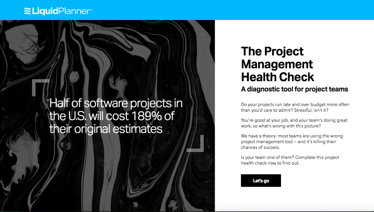
The look and feel Bex and Matt created
No linear process, this
When you build a tool like this, you’ve got copy, design, UX and development teams involved, and it’s a less linear production process than you’ll see on your more traditional content projects. So you need to get everyone working together early, with frequent catch-ups throughout. (That was Jodie and Rudy’s job – our account manager and digital PM on the project.) When copy had to be changed as the layout and design evolved, or a development update called for a design tweak, Jodie and Rudy made sure nothing slipped through the cracks. It was a management challenge but also kind of fitting: if we were going to refine our agile processes working on any project, it was this one.
Give them more than just a score
We had some questions to work with, but we knew we wanted to reward users with more than a straight percentage score. Once people commit to taking the test, we owe them something for their time. So we looked for patterns in the questions and noted where certain project management capabilities appeared: collaboration, project insight and predictive scheduling.
We weighted individual questions and answers according to their importance, and grouped them into the three categories. These helped us evaluate users, so we could add more depth to their scorecards and make more constructive content recommendations.
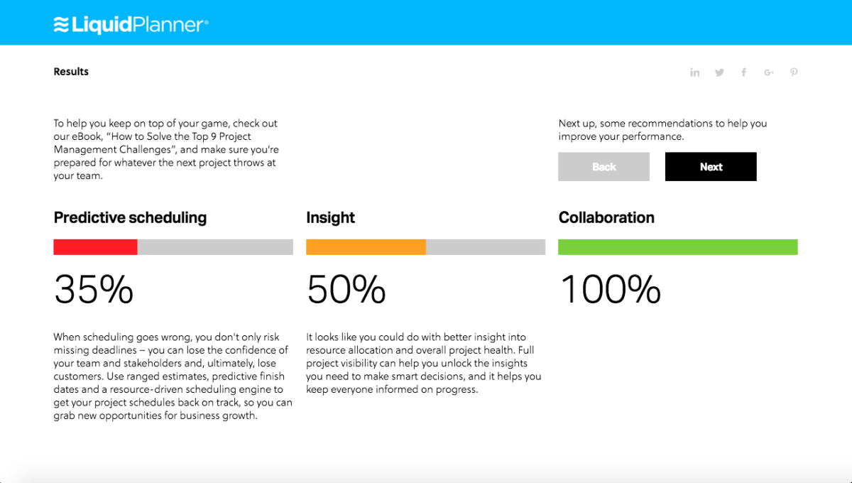
Breaking it down
In development
At some point, the dev team get let loose on the build. I’ll let Dave, our head of dev, explain how it looked from where they were sitting:
“Before we started coding, the principal of the build was based around one giant mother of a Google Sheet, with loads of cool logic and goodies in there – my favourite being how comprehensive the question weighting parameters are. There are some super-tailored question gearings in there.
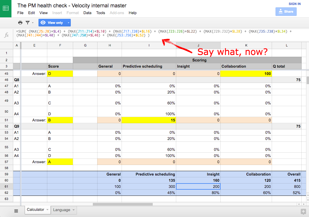
One big mother of a Google Sheet
“It helped that they were the nicest client ever – no tech barriers, so we were up and running in no time. (Sometimes there are reams of red tape and legal formalities around this.)
“We built a really cool Marketo integration – automated follow-up emails with conditional messaging and recommendations, so lots of dynamic elements. And there were plenty of UX considerations, like making the quiz work on mobile, making it swipe friendly, thinking about how users could jump between questions, and so on.
“The design is a pretty simple interface, which means the little details are extra important to show those nice touches: the animations around the result bars, the animations on the liquid marbling, the easing between slides…. stuff like that.”
Creating a new look and feel
From the Velocity studio, Matt and Bex led the creation of a new look and feel for the client: a liquid marbling effect to capture all the fluid, flexible goodness of the software, below. (Note: you don’t see this in the tool that’s live today – the new look is on hold until it’s rolled out more widely online). But you can still see our work in the layout and UX – just not in the visuals you see online now.
Designing with dev in mind
Bex explains: “This was so crucial. It helped us with our direction from the beginning, and made sure our ideas would come in within budget. It also ensured there were no nasty surprises for the devs when we handed the design over to them.
“Delivering a tool like this on a budget is always about compromise, and sometimes we designers have to swallow our stubbornness and accept that some things just aren’t possible. But the devs always tried to find the best solution to any challenge, so they kept us happy!”
And Matt tells me: “The tool has to look good wherever people use it, so we’re designing for viewing on phones, tablets and bigger screens. We need to fit all the relevant information in each format in a way that keeps people interested over all nine questions, and beyond.”
Thinking outside the tool
More important than taking the health check is what comes after. We were confident in the premise of the tool and the experience we could create, but we had to think about taking the results and using them to kick off further communications with the user.
We needed to associate all this great data with an email address. That meant holding back some of the finer detail from the results (to be emailed in a full report) and making recommendations about which other bits of informative content the user should read to improve their PM performance – tips based not just on their overall score, but on their performance in those three categories we identified earlier: collaboration, project insight and predictive scheduling.
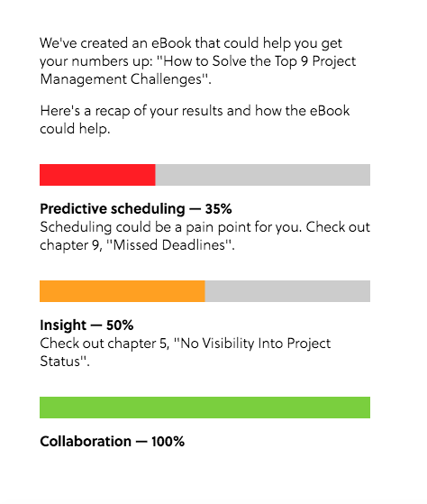
Score-based recommendations
Keeping in touch
Getting all that information together and sent to the user was a challenge, so our resident Marketo maestro, Agustin, created a dynamic email to do the hard work for us.
After submitting a form at the end of the tool, you receive a triggered email from Marketo with your report and your content recommendations – based on the variables that make up our scoring system. All automated. All recorded in Marketo.
Automation is our friend
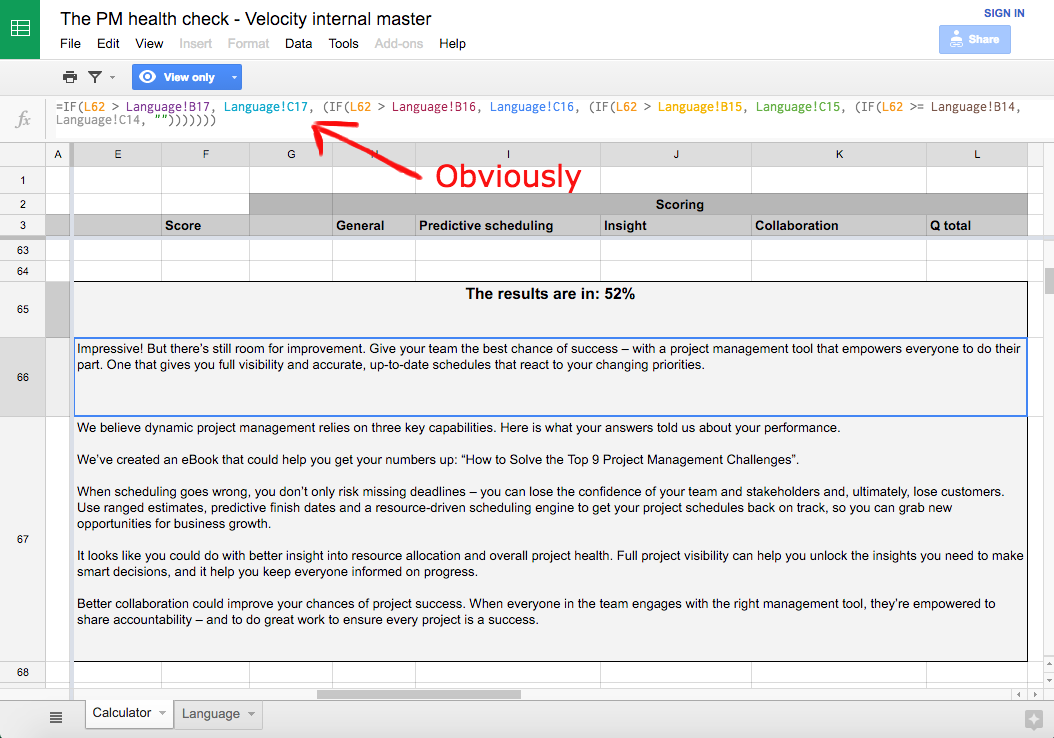
Each of those variables or themes invoke a block of recommendation copy in the email. And for each of the main variables, there are ‘sub-variables’ conditioning your results and recommendations. Those are based on a combination of your score around a specific variable plus all the others. For example, serving you a particular piece of text when your ‘Predictive PM’ score is greater than 85% but your ‘Insight’ and ‘Collaboration’ scores are both lower than 85%. There’s a lot of logic in there.
Those email blocks are dynamic in Marketo, giving us the ability to display different copy to users based on these different score combinations. That’s a total of 18 different final emails a user could receive, depending on their quiz results and, rather than create them all, we let Marketo serve them the right one. We’ve used dynamic email content before but not at this scale, with so many variables on a single result, so we had fun seeing how far we could take it.
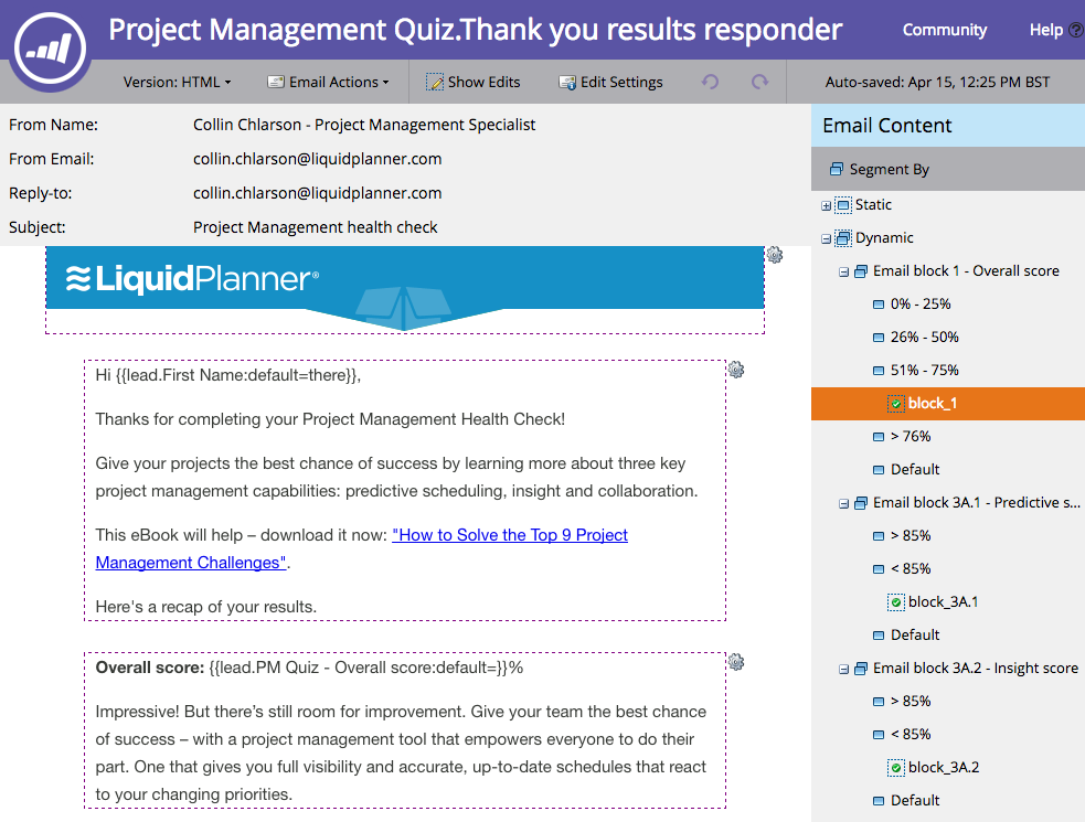
Dynamic elements in Marketo email
TL;DR
- Interactive quizzes are powerful formats that deliver value to your prospects while collecting ‘gold dust’ data.
- It’s not a linear process, so get all teams working together to avoid any surprises when copy hits design, or design hits build. Meet early, meet often.
- The tool isn’t your only concern. You need to keep people interested in the days and weeks after they take the quiz.
- If your aim is to be useful, don’t just give them a mark out of ten. Plan your questions for depth and pattern so you can give layered feedback and tailored content recommendations.
- Don’t let all roads lead to your agenda. This quiz highlights the fact that many teams are jeopardising their projects by using crap management tools – and that there’s a much better way to work. But if people pass the health check with flying colours, we’ll congratulate them. We can still help them out with some extra resources without going hard on a sales message they don’t really need right now.
- Make the outcome clear – for us it was something like: ‘You scored well here but not so well in this area, so you should check out this particular section of this piece of content for help.’
- Right from the start, think about how you’ll integrate the build with the email flow (or whatever kind of marketing or sales campaign) you’ve got planned for the leads you generate.
- Let automation do the heavy lifting for you. We set up our Marketo model so we could go deeper on quiz results and content recommendation variables without worrying about getting swamped.
- What did we miss? Let us know…

Enjoyed this article?
Take part in the discussion




Comments
Chuck Prentiss October 12th, 2019
I’m looking forward to receiving all of your Spam.