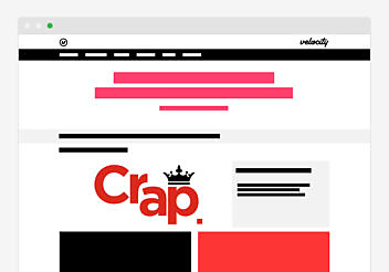
Check out our new site! Nice, huh!
How exciting (for you), we hear you say – but bear with us. At the risk of mistaking you for someone who gives a crap, we thought we’d tell you a bit about how this website came to be. You never know, it might be useful.
Maybe you’re planning a new site. Maybe you’re a digital agency that knows you probably should outsource your website build, but just couldn’t trust a bunch of strangers with your baby. Whatever your reason, you’ve read this far, so here goes…
(A short pause while some of you slink back to your Twitter feed.)
I cornered the Velocity folk behind the new site to get the whys and the hows. Here’s what I learned.
A case of the cobblers
Ours was a typical agency problem. We were so busy doing work for clients (because “they actually pay us” or something, idk) that we neglected to keep our own house in order. It was a case of the cobbler’s children, except our kid wasn’t shoeless – it had a pair of old crocs.
Stan (Woods, Velocity boss) told me: “Our old site did the job – it told the world how we think and it filtered great contacts through to us – but it wasn’t perfect.”
Our website was never meant to be the starting point of a new business lead nurture process. It played a supporting role as our content laboratory rather than a new business engine – which is why none of our content for marketers is behind a gate anymore.
Voice over design
Doug (Kessler, Velocity boss and creative director) added: “Our site was always about the content. But on the old site, voice was centre stage while our design and dev chops weren’t showcased. I used to have this fear a better looking site would detract from that voice, but I think – I hope – we’ve found that balance.”
Learning not to be precious
There was also some reluctance at Velocity to show off too much of our work because it was pretty specialized. You see the end product but not the strategy iceberg underneath – and that big icy hulk of strategy is a big part of what we do.
But we got over that fear and now we trust that if you’re reading up on our stuff you probably know what works and why.
“Don’t look at our website!”
The issue remained that the site didn’t reflect our design and development know-how.
Mel (Bartheidel, senior designer) said, “Websites always have a lifecycle – when it needs to change you can feel it. Velocity grew fast and our focus shifted, so it was time to reflect our broader scope: not just content strategy and marketing. Now design and dev are just as important, and people come to us for those services.”
And it’s not just clients a website should impress. “The old website wasn’t the best recruitment tool,” said Mel. “It didn’t explain everything we do, and it didn’t show off all our skills. When designers and devs came in for interview, we’d say: Please don’t judge us on the site!”
Design: why before how
When Jim, our head of design, asked Mel to think about a new look for the site, her first question was ‘Why?’ What followed was an extensive planning period with UX exercises and wireframes to nail down the plan early with Stan and Doug. It had to reflect the agency’s personality as Mel saw it: very high standards, but still fun.
Mel and the team set about executing their plan to make the site’s design almost invisible – but still beautiful.
“It’s not about the design, but every detail is painstakingly designed. (I think I nearly drove Emilie to a mental breakdown getting the little details right!) The site lives through the content – our content is the hero, our people are the hero. Dave [Leach, designer] did an amazing job with the photography and videos. Everything’s very colourful and friendly even though the site itself is mainly grey and black.”
The build
Our developers’ priorities mirrored those of the designers: they wanted a site they could be proud of. Leading the team was Digital Dave (Welch, head of dev). His hopes for the new site were forged in the pains of the old one.
“The old site went stale because the team didn’t use it regularly, and no one used it because it was a bugger to use.”
It was an opportunity to overhaul the site based on best practices and new web trends – the stuff we’ve been recommending on client projects and a few other things we can test on ourselves.
Going dot com
But right from the start, Dave was slaloming through red flags. None bigger than the big change from .co.uk to .com.
“As a client, Stan was the voice of caution, pointing out what could go horribly wrong. Switching to .com was a prime example: in terms of the potential SEO damage you can do, received wisdom says steer clear. But we fought for the move and the massive long term benefits.
“It was a mammoth migration job. We were changing URLs for SEO, the whole site structure for better usability – and our hosting service for better uptime too. We also took every opportunity to make it more SEO-friendly to combat the hit of the domain change along the way. Because we want the whole team to use the site without the fear of breaking it, we automated a lot of the SEO stuff and locked down backend functionality for general users. It’s a total rethink with clean HTML mark-up and fewer requests so everything talks to each other just right.”
I asked Dave what cool stuff he liked about the site. There was plenty:
- The whole front end experience – nice rollover states, svgs icon fonts, rich showcase components, all responsive to device size.
- Getting smart with Marketo – Dave built WordPress plugin that speaks directly to Marketo
- Ajax and custom queries in WordPress – which give the design guys more freedom to do what they want with content loaders and grid tiling
- Modularity – Dave and Nick took the best bits of WordPress and tweaked them by adding Joomla-esque modularity to the code
- Ease of use!
- The dev area – we’ll have a dedicated dev playground / blog area / archive for our dev stuff. Coming soon…
Dave told me a lot more about the site than I could fit in one post – and a lot more than I understood – so we’ll be revisiting the more techie aspects in an upcoming blog series. Stay tuned.
In the meantime, Dave and Nick are enjoying some quiet time. “The success of the site, for me, will be measured in the sweet sound of silence when no one’s coming to ask me to fix something on the site every other day.”
Project manage this
The unenviable task of planning and resourcing all this fell to Sohvi (Innanen, account manager) and Rudy (Seenevassen, digital project manager).
“I’m proud of how the team came together – especially in such a busy time at the agency,” said Rudy.
We were determined to treat the Velocity site like any other client project, but of course there were differences.
“This isn’t a B2B tech website,” said Rudy. “It’s a portfolio website. And the team had been working on it for a long time – even before I got involved – so we had to stay motivated.”
Predictably enough, resourcing was the toughest job for Rudy and Sohvi, working around other client work.
“The designers have been amazing – when you have their time! And it’s the same with Dave and his team – they don’t just code sites, they’ve got both sides covered: creative and strategy. The hardest part is getting the structure in place so they can do their work. We got there in the end – and Phase 2 is coming soon.”
Client feedback
I asked Doug how the new site build compared with the old one.
“Last time we kind of groped and iterated. This time we captured everything up front with the wire frames and IAs. Of course it helped that we could trust the designers to make calls. But we didn’t play entirely by the rules: we took our time and changed our minds (sorry, Rudy!) – generally did stuff we’d charge a client extra for.
“I think the main reason it was painless this time was we know who we are as an agency a lot better now. For us, a site should be a filter more than a magnet – if the right people come and eat the content, it’s working. We’ll keep testing until we nail that.”
Nuggets, to go
- Websites have a natural lifecycle – you’ll feel it when yours is growing old
- If your company changes direction, pivots or pirouettes, your website should probably do the same
- If you’re keeping the site build in-house, try to treat it like a real client project – we almost managed it, and the discipline paid off
- Don’t be precious about sharing your content and case studies – trust your audience to see the strategy behind the work
- Your website is a recruitment tool as much as a new biz tool – if your specialists aren’t proud of it, then jobseekers probably won’t be impressed by it
- Always be testing
Bonus tip: Never work with animals
Stick with the video banner on our new home page for a few seconds and you’ll see Velocity’s yappy mascot, Zippy the dog. Or, to give him his full name around the office: “Shut the fuck up, Zippy!”
Originally we had the smart idea of strapping a GoPro to the back of another Velocity dog, Juno, Doug’s sprightly Sprocker – see below. But it turns out that any more than ten seconds of that joyride would introduce nausea to the UX.

Enjoyed this article?
Take part in the discussion


Comments
Saleha Williams Clarity Creative Ltd October 20th, 2015
Guys, I totally applaud you. Have always loved your work and see you as a real inspiration in the industry.
We are in exactly the same position i.e needing desperately to update our own website, but like you, we have grown quickly, are always focused on client work and simply need to pull the studio team together and treat it like a paid for client project. …….pizza and red wine await – you know the drill! Thanks for sharing your story.
Great new site, adore the Zippy banner and totally get the Juno Go Pro idea (we tried the same on our Barney – but he just slept! ).
Thanks for posting and best of luck with the new site.
Saleha x
Doug Kessler November 9th, 2015
Thanks Saleha!
S.W. Buxtehude October 21st, 2015
Personally, I could watch JunoCam all day.
Carolyn Free Range Web November 1st, 2015
Great stuff. Congratulations guys!
Carolyn Free Range Web November 24th, 2015
Great stuff guys. Congratulations