An interview with Jer Thorp, data artist.
For post #4 in the infographics series, I’ve decided to talk to someone who does creative data work every day.

Jer Thorp is a data visualization artist who has worked for the New York Times, Popular Science and other publications.
He’s a co-founder of The Office for Creative Research and was involved with the creation of the 9/11 memorial, for which he designed an algorithm that helped arrange the victims’ names in a layout that reflects their relations with each other. Click here to check out his work.
I’ve talked to Jer about infographics, data visualization, and why data matters.
This series of blog posts started out of an interest in infographics as a format. Lots of people seem to have opinions on what they should and shouldn’t be. Do you?
In the end it all comes down to opinions. But I think there’s an important distinction we should make between infographics and data visualisation. Infographics are all about communicating ideas and information. They’re not necessarily translating data into visuals. Infographics can contain data visualization, but data visualization can’t contain an infographic.
That doesn’t make data visualization any less subjective or biased than infographics, by the way. Actually, infographics tend to wear their subjectivity more on their sleeve.
Do you think data literacy is becoming more important?
It’s a fact that, by producing data, we’re always biased – it’s important to be aware of this subjectivity. Scientist are aware that there are errors around any measurement. But from an early age, we’ve been taught the fundamental language of authority that comes with data visualization – we automatically think of it as true.
And yes, there is a lack of data literacy among the general public. People don’t ask the right questions when they’re presented with data: like which units are we using, where does the scale start, and so on. It’s something we need to teach more. It doesn’t come naturally with more exposure to data.
How did you come to become so interested in data for your work?
Back in the 1990s, I first started using computers for creative purposes. The big data world we live in today, it didn’t exist back then. I was interested in form, and algorithms, but the numbers I was using were computer-generated. I wanted real numbers from somewhere else. And around that time, the New York Times announced that it was opening up its archives and releasing an API so everybody could plug into them. So I converted language data into numbers and started working with it. I guess if I’d started with weather data or the stock market, I wouldn’t have gotten the idea that data can come from anywhere.
You did a piece for Popular Science a few years ago. I love it, because it contains a lot of information, yet it looks so simple. Can you talk about that project a little?
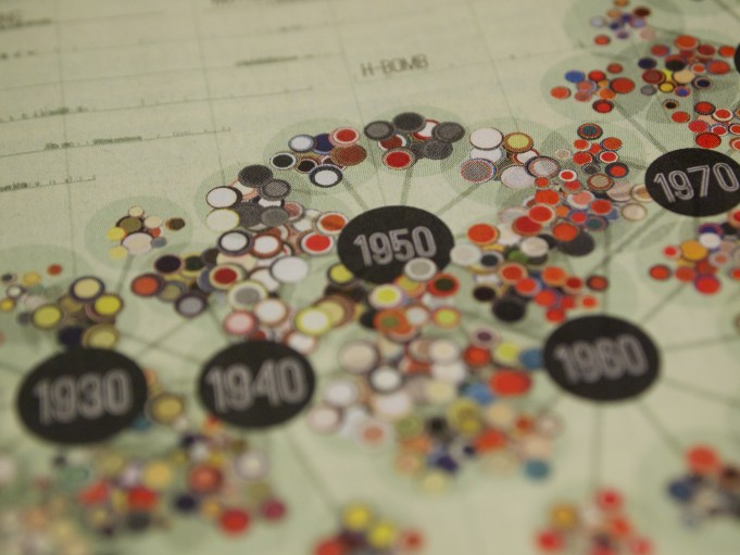
Sure. The editors approached me and asked me to work on a visualization that explores their archive. We wanted to look at changing cultural trends over time. The magazine goes back almost 140 years, so there were huge amounts of data there. The data was quite messy, though, so we had to clean it up. Then we started to iterate. We went through a couple of hundred iterations before we arrived at the final piece.
It’s a kind of molecular chain of clusters, each of which represents a year of the magazine (The color of the cluster is derived form the colors of the cover pages of that year). The cluster size is determined by the number of words in each issue, and the clusters are surrounded by terms with a high frequency in the copy. So the visualization contains information both about the look and about the content of the magazine over time – and the issues and buzzwords that people were reading about.
Language plays a role in quite a few of your works. I love Wordplay, for instance, a tool that lets users explore the language of Shakespeare or Freud, and find grammatical equivalences. Have you always been fascinated by language?
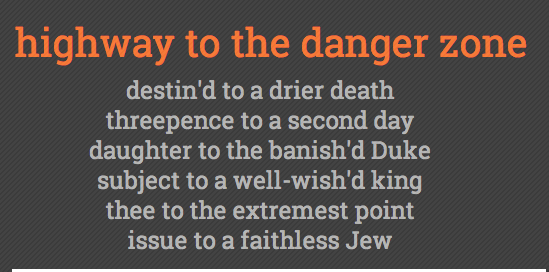
I’ve always been fascinated by great ideas, and I’m a big reader. One of my favourite authors is David Foster Wallace. His novel Infinite Jest, with its many footnotes (some of which have footnotes of their own) is maybe not a ‘data novel’, but it’s definitely about the growth of information around us. Thomas Pynchon’s Mason & Dixon is another book I’d recommend.
When you talk about your work, you often say things like “I wrote a simple little algorithm” or “It only took me a few hours” – you make your data work sound very simple.
Well, data visualization isn’t hard, definitely not from a computational point of view. It’s a tool that helps you play with your data and change your scope.
Does it get easier with practice to translate data into visuals? Do you intuitively know what your data wants to look like?
No. Everyone who works with data knows that there’s always a lot of trial and error involved. That’s okay, it’s part of the process. There isn’t just one visual way to present data. We should think of it as question farming, rather than answer farming. It opens up more possibilities.
You’re a ‘data artist’. Isn’t that term a little misleading in that data is your material, not your subject matter?
Maybe. As I’ve said before, data can come from anywhere. I’m interested in the things that are encoded in the data.
And what I think we as a society need to become more aware of is that data isn’t something abstract that exists out there independent of our lives. The fact that we’ve raised it means that it relates to our lives somehow.
Attitudes to data differ greatly in different countries. The Germans, for instance, are very protective of their personal data. I think we need to learn to see that we can own our data, and that it’s hugely meaningful.
And we can learn to become more data-savvy for our own good: ”Data philanthropy”, for instance – people donating their cell phone location data to help study the spread of diseases, and such.
Watch Jer’s TED talk on ‘Making Data more Human’

Enjoyed this article?
Take part in the discussion





Comments
There are no comments yet for this post. Why not be the first?