Like most good digital agencies, we’ve been exploring web personas for a while and we’ve found them to be a critical aid to great site design.
If you do them thoroughly, personas mean you can develop better sites faster, ones that meet the needs of your customers, prospects and other stakeholders more effectively. They force everyone to think about what users might actually want to do when they visit your site and then shape the design accordingly.
So what are they? Personas are idealised, but specific, portraits of real users. We try to imagine a real person visiting the site – what sex are they, how old, what job do they have (we try to be as specific as possible, down to the precise company if possible), what type of information are they looking for and what do they want to do it with it once they’ve found it. Properly done, personas should replace guesswork with a clear understanding of what actually motivates people to visit your site and their needs when they get there. If you think about, it’s obvious that someone at the early stages of putting together an RFQ has very different requirements to someone who’s already put your firm on the shortlist and is looking to prepare a briefing document for his management team. Industry analysts and prospective employees have different requirements yet again.
For large consumer sites, it certainly makes sense to conduct research and intervews with consumers to identify the user groups you want to come and use your site. But in the B2B world, we’ve found that there’s really no need for this. A few hours in a room with some key stakeholders in the business – a senior marketing person, a sales guy, a partner manager and a senior techie are usually sufficient – as well as some telephone calls with people in the field, some actual partners or customers should get you pretty close.
That’s because there’s no call to overburden personas. It ‘s all about identifying the precise needs of your visitor groups and then using that to identify the site’s success factors, the navigation structure that best meets those needs, the content you require, the elements missing from your site and the features that are unnecessary.
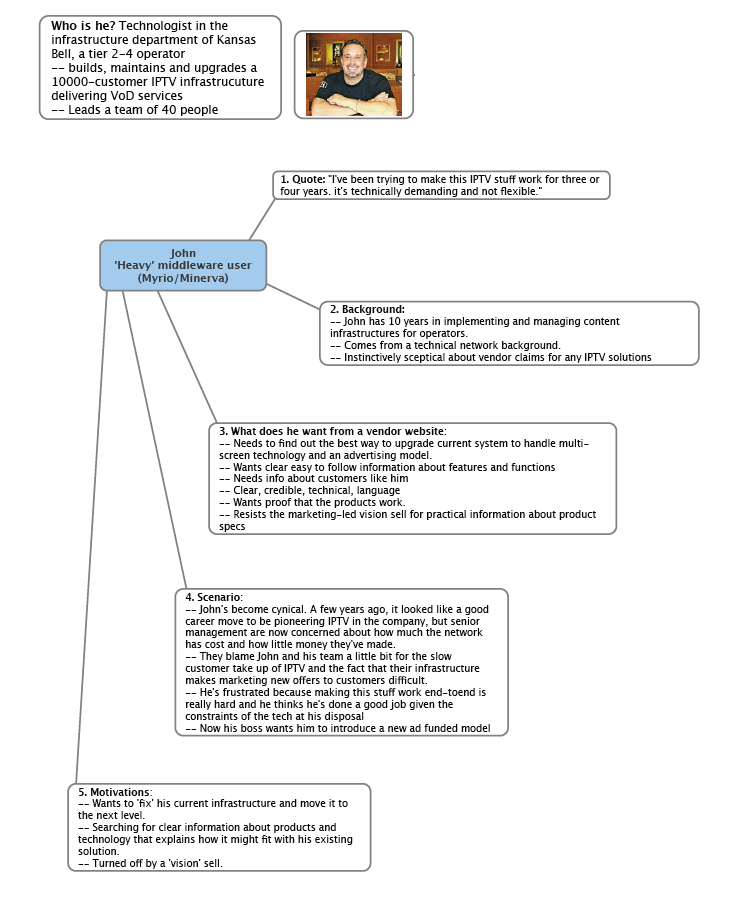
We speed the process up by using a cool tool call Mind Manager from a company called Mindjet – a mind mapping application – that let’s us quickly identify all our über-user types and then, on a single sheet of paper, permits us to summarise our mythical user’s background, his needs when he visits a vendor’s website and a typical scenario – really a detailed exposition of why he or she might be prompted to visit the site.
Here’s an example we prepared earlier.
Once we’ve got the personas done – there are usually no more than eight – we can get really specific on the brief for the web designer.We find doing this can cut the early stages of design by half, because the designer has real people in her mind when she gets to work.

Enjoyed this article?
Take part in the discussion


Comments
Emma Dunstone April 27th, 2009
Different people; different routes. 100% agreed.
(And I’m a big fan of Mindjet’s Manager myself)
Stan Woods April 29th, 2009
Thanks, Emma.
Yep, Mind Manager is our favourite too.
Christine Thompson April 30th, 2009
Very cool idea to use mindmapping to summarize the insights for each persona. I’ve long been a fan of mindmapping (and use both MindJet and similar tools for Mac); however, I’ve never seen it applied to personas. The personas I’ve seen in the past from agencies have been much more elaborate (an approach which has its uses at certain stages of development), but this summary is a great tool for agency-client communications.
Congrats!
Stan Woods May 1st, 2009
Thanks Christine. We’re engaged on a new website projectright now and I’m presenting personas to the team uysing Mond Map next week. We’ll see how it goes.
Fiona Flowers January 6th, 2011
Good intro on personas; I’ve not used Mindjet Manager but I have used Visio; I think that this particular tool, however, would be very useful for a deeper level of persona presentations with regards to interaction and task functionality (as more of a mind map) rather than a simple “mythical” background breakdown based on wants and needs.
Thanks.
hdtube google November 12th, 2019
In addition to being able to make mind maps and flowcharts that are as large as you need them to be, you can also illustrate some more complex scenarios by adding connections between disparate items, use emojis to illustrate what’s happening at different touchpoints, or change the colors of bubbles to illustrate different actions, intentions, or page levels.