Every B2B brand is built on a contradiction. Two critical beliefs that are fundamentally opposed:
#1: We must keep our brand fresh and interesting to stay relevant.
#2: We must maintain a consistent brand image to establish a clear identity.
Weaving these beliefs into a coherent strategy is tough. You can’t really reinvent yourself if you’re constantly repeating yourself. And you can’t really build a distinct and memorable brand identity if you’re always messing around with it.
So most companies strike a balance. They tune and update their brand without compromising on the core characteristics that define it.

That’s the idea anyway. But in my experience, the scales usually look more like this:

When in doubt, B2B businesses play it safe. They rehash preapproved ideas so they don’t have to endure the tedious task of securing internal buy in. Or they stick with ideas and practices that “kind of” work instead of trying to do something new, bolder and better.
This makes sense to some extent. It seems like the cheaper, more sensible, less risky option.
But is it really?
Because too much consistency can be a bad thing. It can cause marketers to water down potent new ideas. It can lead content teams to create a bunch of assets that all look the same. And it can result in a predictable brand.
A boring brand.
The trouble with consistency
The internet is a cruel place. Put something out there and it’ll probably be torn apart by at least a dozen hungry trolls who feel anonymous enough to let rip.
But as every creative person knows, that isn’t the worst reaction you can get online.
The worst reaction is no reaction.
If you’re a B2B marketer, you’re familiar with this pain. It’s hard to get B2B buyers to do anything – click a link, open an email, download an asset – and it’s getting harder all the time.
There are loads of reasons for this:
- People have more content to choose from, and the same amount of time to read it.
- The quality of this content is improving all the time — it’s becoming more helpful and less fluffy — so it’s becoming harder to blow people away.
- People are jaded — they know their inbox and newsfeeds will be flooded with promotional messages and frankly, they’re sick of it.
This means your brand has to work harder than ever to stand out. Your logo has to shine on that banner, your GIF has to jump out of that newsfeed and your eBook cover has to grab your reader by the mouse and drag them to page one.
This challenge becomes more difficult if you’re playing it safe. When your audience has seen the same imagery, style, language and colours a hundred times, the impact starts to wear off. Before long, their built-in marketing filter is blocking it out.
They stop clicking, they stop downloading and they stop reading.
This is hardly surprising when you consider the typical B2B buyer.
- They’re intelligent people who get bored easily.
- They know exactly what marketing tastes and feels like.
- And they know a thing or two about innovation and the value of creativity.
These people need answers. And they want to work with, and buy from, exciting and dynamic brands.
They don’t want to see the same thing over and over and over again.
Yet, time and time again, that’s what B2B brands are producing.
Solving the paradox – a starting point
The dangers of excessive consistency are most obvious on the covers of content assets.
Most B2B businesses come up with a template and impose rigid brand guidelines that dictate what’s allowed and what isn’t. Usually, this means that the same colours, stock photography and fonts (Roboto or Helvetica, naturally) are replayed across dozens of assets.
The finished product usually looks something like this:

This kind of lock-step consistency is fine for a set of product brochures. But it’s death to a content program.
Sit a few of these assets next to each other and nothing stands out. Your $15K eBook looks the same as your $3K brochure. The unique value of each piece is lost and your audience has little idea what’s aimed at them.
Instead of a content library full of editorial richness and surprise, you’ve got a stack of stuff that flies through the Brand Review… but gathers dust on your digital shelf.
That’s a big problem. It means you’re wasting money, you’re wasting time and you’re not meeting your audience’s needs.
So if you’re looking to reassess the balance between consistency and reinvention, this is a good place to start.
You just can’t afford to waste resources on ignorable content.
A different approach
Every piece of content you create is telling a different story and doing a different job. So every cover you create should reflect this.
This isn’t a radical idea. Publishers do it all the time and many B2C brands are following suit with their home-grown content (See RedBull’s Red Bulletin).
Wired is another great example. It regularly experiments with colour, fonts, iconography and imagery to create covers that are closer to art than adverts – and they’re always surprising.


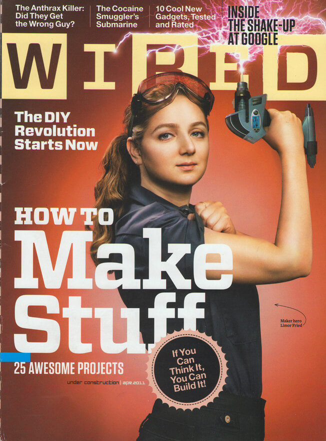
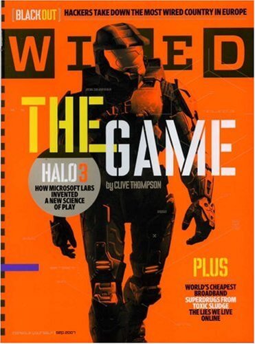
(credit: Wired)
These covers work on several levels:
- They resonate and connect with Wired’s readership (design and tech nerds)
- They reflect the magazine’s personality and identity
- They stand out
And often they make a statement, which is something that all B2B brands should do.
All the while, Wired stays true to the core principles of its brand identity. Sit a few issues side-by-side and you’ll notice that certain elements are always consistent. Its logo rarely changes, some visual motifs are reused and the tone of the message being communicated is the same.
But it’s never boring.
Wired covers have evolved to survive one of the toughest environments in all of commerce: the newsstand. Here, any magazine has about a second-and-a-half to say two key messages: “Amazing stories here!” and “Remember me? It’s me again!”
Well, the internet is the world’s biggest newsstand. So you need to send both of these messages too,
Of course, there’s a difference between an issue of Wired and an eBook on cloud migration, but they also have a lot in common. Both are covering weighty, complex and serious topics. Both are talking about technology, business and innovation. And both are created by talented writers and designers.
Every B2B brand can do what Wired is doing to some degree.
You just need to give yourself the freedom to experiment, test new ideas and relax the dress code.
Bowie and B2B marketing
The best brands are consistent. They use repetition to imprint an idea on their audience’s mind.
But too much consistency can be a bad thing.
If you repeat anything a number of times it starts to get stale. Your words become bland and your graphics start to look flat.
That’s why effective brands are always evolving. They’re adaptable and surprising. They can take many forms without losing certain defining characteristics. They’re a bit like Bowie in the seventies.
Every B2B brand needs to embrace this kind of reinvention. We may not be flogging eBooks on newsstands but we still need to stand out.
In a way, we face a bigger challenge than the likes of Wired. We’re trying to engage people who may not be familiar with our brand or our products and we’re competing for attention in social media newsfeeds and inboxes already crammed with eye-catching content.
It’s a content-saturated jungle out there. And only the most adaptable and innovative brands will survive.

Enjoyed this article?
Take part in the discussion





Comments
Ashley Shailer Inverta October 12th, 2018
This post should be required reading for big B2B brands who want a shock-and-awe content strategy, but have zero appetite for humor, empathy, or uniqueness of any kind.
I loved this post. I want to print it out and hang it on my wall. Thank you!