This is the third post in our ‘Let’s Steal From’ series, in which we pick a great piece of content that all B2B content marketers can learn from — then scrutinize the hell out of it to figure out how it works.
In past posts, we zoomed in on Follow The Frog, the amazing film from the Rainforest Alliance, and Epic Split, the wonderful product demonstration for Volvo Trucks.
Both of those pieces were produced in this century.
Today’s amazing content was produced almost 150 years ago, in 1869.
It’s the famous (well, geek famous) infographic depicting Napoleon’s disastrous campaign into (and out of) Russia in the War of 1812.
The infographic was created by Charles Joseph Minard, a French civil engineer and pioneer of the use of graphics in statistics and engineering. Here’s his engraved selfie (dig the comb-forward look):

I love a great B2B infographic (or any great infographic) but I’ve never been moved to tears by one until I saw this masterpiece, in Edward Tufte’s amazing book, The Visual Display of Quantitative Information (my all-time favourite book on infographics). Here it is:
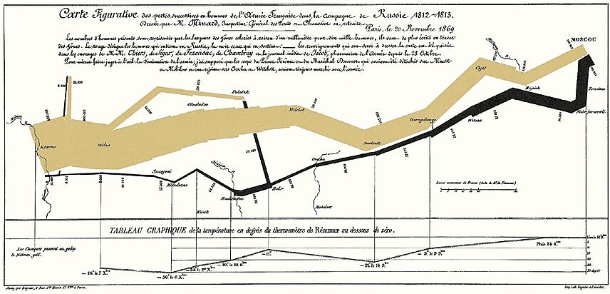
To view it in closer detail, go to the Wikipedia page and click on it.
A bit of background
You don’t have to know that much about the War of 1812 to understand Minard’s graphic and to extract its powerful story (which is one of the reasons it’s so great).
But I’ll coddle you here (you lazy bum) and give you the historical lowlights (I got them from Wikipedia but let’s pretend I rattled this off from the top of my head in a characteristic display of casual erudition):
- Napoleon’s Russian Campaign started on 24 June 1812 when his soon-to-be-misnamed ‘Grande Armée’ crossed the Neman River to kick some Russian butt. (Never mind why he thought that was a swell idea — the reasons are as dumb as the ‘whys’ behind most wars).
- Rather than engaging Napoleon’s 680,000 troops, the Russians just kept falling back, back, back – leaving Cossacks behind to burn the villages and fields. This ‘scorched earth’ tactic was intended to deny the invaders the ability to live off the land. And it worked a treat (if you weren’t one of the people who lived in one of those villages).
- France was unable to supply such a big army, so they starved and froze and their horses got sick. And when the soldiers went out to find food, the Cossacks picked them off.
- Almost no one made it home. By the time the remains of his army crossed the Berezina River on the way back, only 27,000 fit soldiers remained.
This little detail is the most moving part of the whole graphic, showing the breadth of the column at the start of the campaign and the thin black thread that returned:
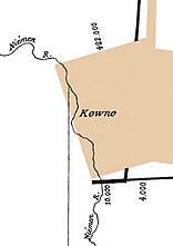
You can see the swelled ranks of the Grande Armée heading into Russia, then watch it cinematically dissolve into a scraggly, limping line of starving, returning soldiers. The whole horror of war is somehow captured in this tiny detail.
The campaign wasn’t just a turning point in the war, it was a turning point for France’s role in Europe. Forever.
Okay, so now take a look at how Minard told this story. In a picture…
Reading Minard’s infographic
The original text published above the map explains how to view it:
“…The numbers of men present are represented by the widths of the colored zones in a rate of one millimeter for ten thousand men; these are also written beside the zones. Red [now kinda brown] designates men moving into Russia, black those on retreat.”
The infographic does a lot of things in one frame:
- Shows the invasion and retreat on a map – including the splinter campaigns and retreats; the river crossings (you can see how many men are lost at each one) and the battles (Smolensk didn’t go at all well).
- Shows the dramatic loss of the soldiers’ lives – as the coloured columns get narrower and narrower.
- Maps this against the brutal winter weather – using the temperature chart along the bottom to show how mercilessly cold the retreat was. (multiply the Réaumur temperatures by 1¼ to get Celsius, so −30 °R = −37.5 °C = FUCKING COLD).
In total, it shows a whopping six data points in a single, two-dimensional graphic: the number of Napoleon’s troops; distance; temperature; the latitude and longitude; direction of travel; and location relative to specific dates.
And it does it simply and clearly – even to a history-challenged, non-French speaker 150 years later.
That’s why Edward Tufte calls it, “Probably the best statistical graphic ever drawn” (‘probably’?) and Étienne-Jules Marey (you know, the French scientist, physiologist and chronophotographer) (yeah, him) said that it, “defies the pen of the historian in its brutal eloquence.” (Ooh, I like that).
Here’s to brutal eloquence.
So here’s what I think we B2B content marketers can steal from Minard’s masterpiece:
Start with a great story.
Minard didn’t start making a graphic, then go looking for a story to tell. But that’s exactly what happens in so many B2B marketing departments.
Instead, he knew he had a gripping, chilling, breath-taking story: the story of the loss of life during a single, stupid campaign. Now all he had to do was tell it.
Earn every micro-second of attention.
When I first came across this graphic, I was delighted by the way it made me lean in. A lot of data-rich infographics may be beautiful, but they often do the opposite: they keep the reader away instead of making us want to interpret them.
Minard rewards our attention with instant information, no matter where your eye lands.
Remove everything extraneous.
Tufte is famous (well, geek famous) for railing against what he calls Chartjunk – ‘all visual elements that are not necessary… or that distract the viewer from this information’. [See examples in 9.8-out-of-10 B2B infographics or this Google image search — beware, may induce epileptic or taste-related seizure].
Separate the data dimensions.
Each of the data dimensions in Minard’s chart can be read on their own. Temperature doesn’t clash with time or location. Each is clearly and separately depicted
Don’t be afraid of depth and detail.
Everybody wants everything to be ‘snackable’ these days. Now, I’m never one to knock snacking — it’s my second-favourite form of self-abuse – but sometimes you need a proper meal.
Let craft blossom.
Content production is always under so much time pressure. I get it. But why not grab one piece out of ten and give it all the attention and craft that it deserves? Why not hire talented people and give them the time and space to do their jobs to the best of their abilities?
Not only will you get a great piece of content, you’ll get a team of talented people who will kill for you the next time around. (Ever have a team ready to kill for you? Feels great.)
Be a genius.
To make an infographic as good as this, it really really helps to be a genius. So start there.
Your turn.
Got any awesome infographics that can hold a candle to Minard?
Got any response to this one?
Got a keyboard? (The pathetically empty Comments field awaits).
Others posts in the ‘Let’s Steal From’ series:
You mean you haven’t read these yet? Shame on you.
The Simpsons – The masters of storytelling, character, humour… and stealing.
Seventeenth Century Explorers – And you thought marketers had a rough time convincing their audience.
The NBA – It was just basketball, then it took over the world.
Follow The Frog – Max Joseph and The Rainforest Alliance skip the guilt trip and get practical (and very, very funny).
Paths of Flight – a beautiful, understated film from GE Aviation
Epic Split – Jean-Claude van Damme nearly rips his tight jeans (and dies) for Volvo Trucks.
Great First Lines of Novels – Turns out Orwell, Salinger, Garcia Marquez were content guys.
Rand Fishkin and Moz’s Whiteboard Fridays, which owns SEO.
Airbnb City Guides – Useful, optimized, crowdsourced.
Icelandair – a 7-hour nurture process in the sky.
TED Talks – SO much to steal here…
Catch up, lazy-bones.

Enjoyed this article?
Take part in the discussion




Comments
Ken Carroll Ken Carroll December 7th, 2015
I love when you get great insights into content marketing from outside then field. It gives them a real validity. These re great. Nice work, Doug and the team.
Doug Kessler December 7th, 2015
Thanks Ken — I love that too. The best ideas come from weird places…
Lydia Cockerham Skeleton December 7th, 2015
Thank you for introducing me to this astoundingly gorgeous infographic.
And thanks even more for preaching the worth of giving great content time and energy to grow. I’ll definitely be passing that argument on.
Doug Kessler December 7th, 2015
Thanks Lydia. I love turning people on to this graphic.
Liz Roscovius D2 December 7th, 2015
I too, am a Tufte fan and have been for many years. Until now, however, I never realized that could categorize me as a geek! (Not that that’s a bad thing). Thanks for your insight, so eloquently offered. I will definitely be sharing….
Doug Kessler December 8th, 2015
Welcome to the International Brotherhood of Graphics Geeks, Liz. Your card is in the post…
Marcia Riefer Johnston Marcia Riefer Johnston, Inc. December 25th, 2015
Doug,
I don’t know which I enjoyed more, the reminder of this breathtaking infographic or your way with words as you describe it. If Tufte had written more the way you do, people wouldn’t have to be geeks—hard-core readers willing to fight through his prose—to appreciate the value of his insights. (Eddie, if you’re reading this, JK.)
Doug Kessler December 27th, 2015
Thanks Marcia! I loved the Tufte books — but maybe that’s a sign of being a geek.
His prose follows the advice he gives about graphics: eliminate everything that doesn’t contribute to the message. At times, this can come of as a bit charmless…
But I guess that’s what you get when you pick up a book called, ‘The Visual Display of Quantitative Information’ instead of ‘InfoMania’ or ‘Eye Candy II’.
And who’s Eddie?
Gabi Paulson UviaUs August 3rd, 2018
Dare I ask what the first favorite form of self-abuse is?
Doug Kessler August 3rd, 2018
Jeez, did you have to?
Apr AffinityX April 17th, 2019
can’t remember how i got to stumble upon your unique blog posts upon this ocean of writing-tips-copying-one-another. just the stuff that i need! kudos to the tips worth stealing!
Doug Kessler April 24th, 2019
Thanks, Apr!