Recently, we’ve been talking a lot about the power of marketing with a compelling value exchange.
That’s because we’re convinced that one of the main drivers of the marketing effectiveness crisis in B2B is that user goals consistently take a backseat to company interests.
The good news is that because users have normalized such a lop-sided value exchange, it’s easier than ever to stand out by giving something valuable away.
I’m not talking in hypotheticals. I came across something a couple of months ago that did just that. And I was so delighted I became a customer.
While we’ve already gassed them up in a previous blog, I wanted to take a moment to show you just how great Relume’s homepage is.
Your buyers want to play
Every day we get prodded by some AI start-up or another promising to enhance, enrich, optimize or automate one of our processes.
And it means we get to hit pause on being marketers and become prospective buyers. (Which, ironically, makes us better marketers. Buy some SaaS from time to time — it’s eye-opening.)
We’re in full AI-experimentation mode — looking at a lot of websites and trying to make a series of quick judgments to appraise what’s on offer.
That means we’re asking all the questions buyers do:
Is this real?
Is it easy to use?
Is this product roadmap theater or is this fully-baked?
Is the pricing clear?
Is the onboarding process any good?
Something I realized quite quickly is just how fatiguing it is to buy software. Even if the websites are all great to use (and they aren’t all great to use), things start to feel overwhelming very quickly.
Features blend together, and brands become indistinguishable. There’s only so much information you can absorb passively before you reach saturation point. Before long you just want to get your hands dirty and try the thing.
But this is where SO many SaaS products start putting up obstacles. They optimize their whole site to get people to click the “Try demo” button, and then stick a form in the way.
And I know what a form means. I’m a marketer. I know what someone like me does when a buyer presses that button. And so I think, “nice try website,” and I walk away.
This brings me to Relume.
The expect a form. Give them an experience.
Relume’s page is a bit of a magic trick.
Not only is the first thing you see a gateless demo, but it’s a demo that pulls you in without explicitly signposting what’s going to happen.
Most SaaS sites are peppered with enough flashing “Free Demo Here!” signs to make Wile E. Coyote blush—only to bring a gate crashing down on any visitor curious enough to click.
Relume doesn’t even tell you it’s about to blow your mind.
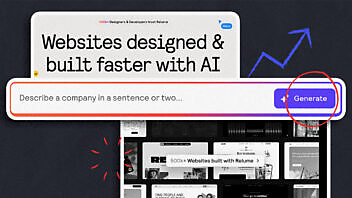
The page introduces Relume as a company that helps you build websites faster with AI—as a design ally to generate sitemaps, wireframes and style guides.
Underneath the header, you’re immediately presented with a text bar prompting you to describe a company, and a button that simply states “Generate.”

And I don’t know about you, but something about the singular verb “Generate” makes me feel like something cool is going to happen if I push it.
It’s actionable, it relates to the AI use case of the product, and it’s kinda exciting. What am I about to generate?
So I dreamt up a prompt describing B2B-kinda company we’d probably work with and did a big ol’ click on “GENERATE.”
And, well, just look at what you get.
1. An AI-automated sitemap of your company’s new website
2. Some basic, best-practice-led wireframes with AI-generated copy
3. A rough style guide for the new website, including colors, typography and UI styling
I am in the product! I am experiencing the thing they want me to buy! Why doesn’t everyone do this?!
One-click demos work
The demo experience with Relume was so good we became a customer. The whole thing was simple, direct, and immediately valuable.
We could see what it’d be like to be a customer. And we liked it so much that we asked them to talk to us. Most marketers dream of that — myself included.
One important caveat is that Relume has some advantages here.
Their product is slick as hell. It’s been elegantly designed to demonstrate the value proposition from the first click.
Other B2B products or services are complex — there are multiple user journeys, finicky tech integrations and tricky dependencies. It’s rare you can wrap everything up with a neat bow.
But that doesn’t mean you can’t package up something that shows your audience what life looks like with you. Something that subverts the “Try Now for Free (after you fill out all your information)” expectation prospects are used to ignoring. Something that stands out by giving value away for free.
Here’s the thing. I’m not even sure Relume is the best tool for our needs. We’re still evaluating the market.
But regardless of which is the best product, Relume is the one we tried. And that comes with immense stickiness.
So, dear readers, go forth and give some shit away for free, with no expectation—even if it’s something small.
Take it from me, a buyer and a marketer who now has bought Relume to do marketing, that shit works.

Enjoyed this article?
Take part in the discussion


Comments
Divyanshi Agrawal August 13th, 2025
This is a very informative blog! Just like using the right Organic Fertilizer helps crops grow strong and healthy, a well-designed homepage nurtures a website’s growth and impact. Brands like Radhakrit remind us that quality and care make all the difference, whether in agriculture or web design