Generative AI is having its moment in the sun — and it’s casting a menacing shadow over the creative industries while it does it.
The trouble is, too much of the conversation focuses on whether generative AI will replace creatives entirely (by generating images, copy and code from scratch). We think a better question to ask is: How could generative AI make creatives better?
Generative AI may one day be able to take on a fully-fledged designer — or it could fall flat on its originality-deficient face. But spotlighting the ways AI fails to totally replace creatives obscures how it could help them do better work, faster. So we’re shifting that gaze, through focused, practical testing with our generative AI 3-blog series.
—
Welcome to the generative AI design shootout — a 3-part series where we’re testing three big-name generative AI tools on how they handle day-to-day design tasks.
Can Midjourney sub in for your designers? Will Leonardo kill the stock photo industry? And what the hell is Photoshop’s Firefly Beta and is it any good?
We have three specific tests — the first of which is featured in this blog — evaluating how effectively generative AI can support designers in common tasks:
Test 1: Generating text for a whitepaper mockup
Test 2: Creating image variations from royalty free stock images
Test 3: Incorporating a number of descriptive prompts to deliver creative design ideas for a landing page
A quick note on AI’s ethical implications:
Before we put generative AI to work, let’s talk about ethics. There are lots of ways to abuse generative AI, but in design workflow they generally fall into two buckets:
- It can create images that look real, but aren’t.
- It can copy or recreate intellectual property without the consent of the original creator.
The implications here are pretty clear: right now it’s relatively easy to use generative AI to deceive audiences and steal (and profit from) other people’s work.
So even if you’re integrating generative AI into small, discrete parts of your workflow, you should always ask yourself some simple questions to avoid straying into unethical usage:
- Do I have the consent of those shown in my work to appear in it?
- Did I bend the rules to use licensed (or artist-specific) work without paying?
- Can I talk about the data set I used transparently?
- Would I be comfortable talking to colleagues or clients about how I used the technology?
If the answer to any of these is no, then it’s a good early screen to reassess the way you are engaging with generative tools.
OK, enough with the philosophizing. Let’s get on with the test.
Time to start the AI shootout
Imagine you’re pitching a piece of printed content to a prospective (or current) client. You know showing the idea visually will make all the difference, but you can’t spare a designer to mock something up. So how can you use generative AI to help with ideation?
Generative AI tools create outputs based on linguistic prompts. For each test, we used one universal prompt across each tool. Here’s the prompt for test one:
Universal prompt: create a 3D whitepaper mockup for a B2B tech start-up whose product uses AI to analyze data. Dramatic lighting, 8k, photorealistic imagery, soft, medium close-up shot, trending on artstation.
Midjourney
Settings:

Best result:
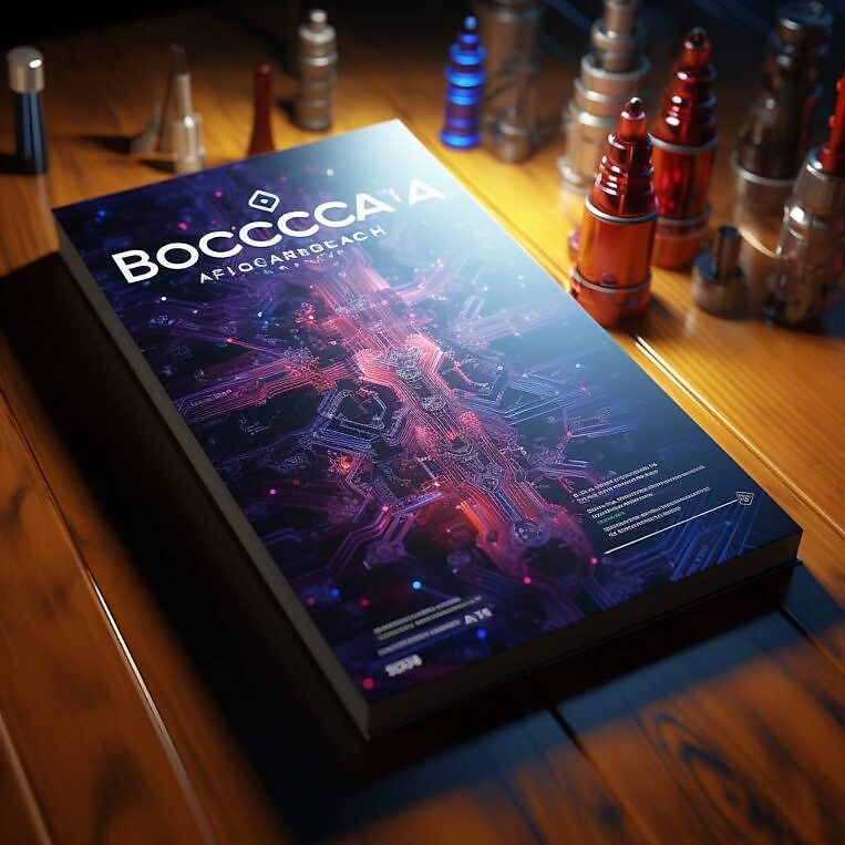
Verdict:
The colours used and the overall aesthetic is excellent, but it really struggles with rendering applicable and legible text. It’s also handled this part of the prompt — a B2B tech start-up whose product uses AI to analyze data — impressively. It’s incorporated a circuit board into the design; conventional, yes, but refined for being this early into the ideation. A plus point is definitely the lighting, which lends a realistic, solid feel to the asset itself. However — a bunch of spark plugs/car lighters seems a strange background decision.
Leonardo
Settings:
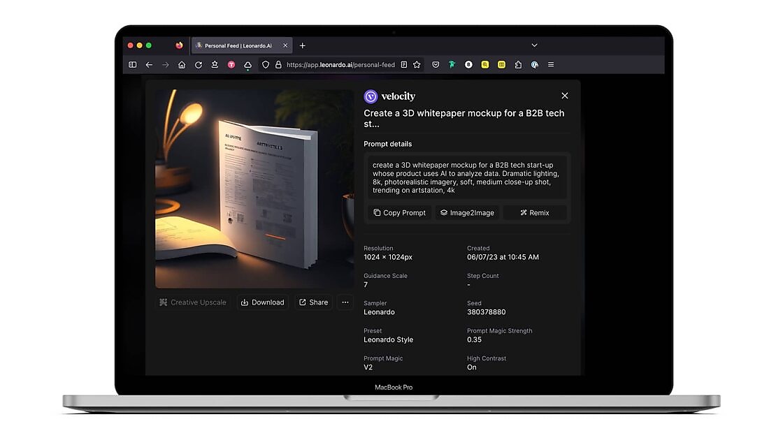
Best result:
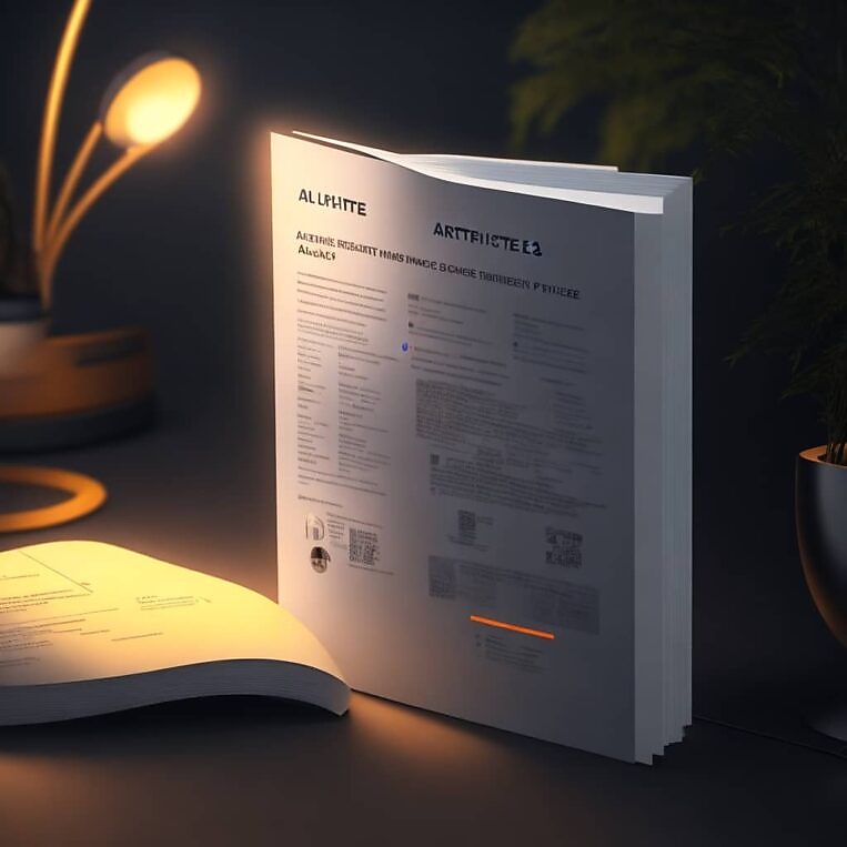
Verdict:
Where do I start? The overall presentation of the paper itself doesn’t remotely look like a real-world whitepaper, and isn’t as clean or realistic as that of Midjourney. But in particular, the text changes font, doesn’t sit on straight axes and the content itself is gibberish. The overall appearance is that of a badly-rendered middle page of a report, rather than a front cover.
Firefly
Unlike Midjourney and Leonardo, you can’t just dive into Firefly and start creating. You first need to read and accept Adobe’s strict rules and guidelines around the ethical usage of the tool.
Adobe has implemented very strict guidance when it comes to generating new images to help avoid possible copyright infringement, which is why there is more of a precursor from the system when putting it to task.

Settings:
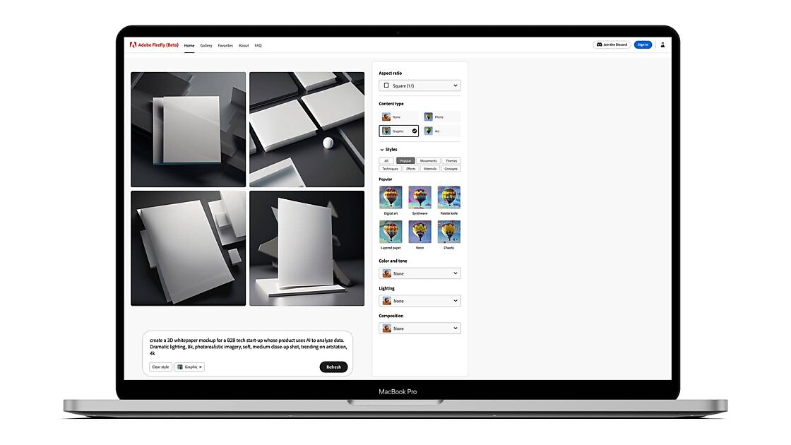
Best result:
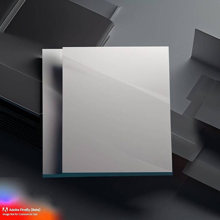
Verdict:
Firefly took the phrase “3D whitepaper mockup” and ran with it! It’s a really clear and presentable mockup that could be used when Firefly is out of Beta. However it didn’t create a design for the cover, probably owing to the stricter moderation rules that Firefly imposes on itself. But it has solved a different problem, which is creating a nice container for pitch work that looks a little more polished than basic flat 2D alternatives.
Bonus:
We also tried Photoshop’s Beta which has a Firefly integration, enabling the creation of generative images. Here’s the result using the exact same prompt.
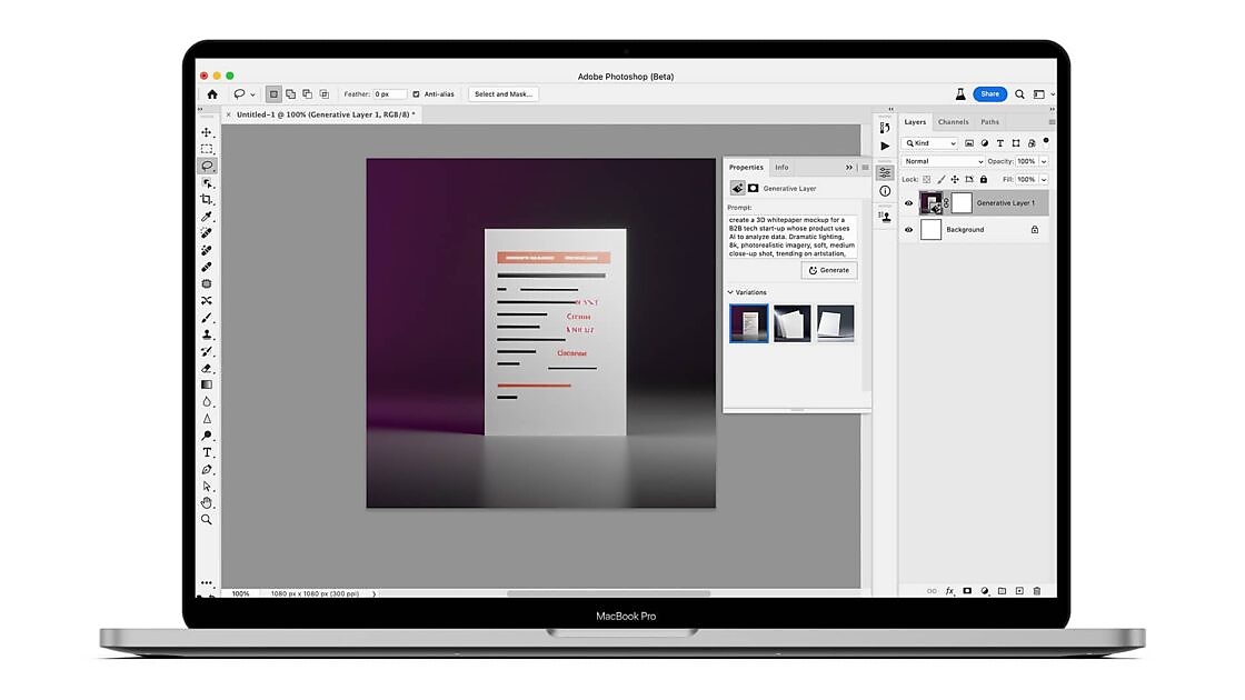
Verdict:
Words fail me. And Photoshop failed words.
Test 1 summary:
This prompt didn’t yield any particularly usable outputs for the initial task of mocking up a design for a piece of printed content (it’s also interesting that text rendering still looks to be a universal issue for these systems). In short, I don’t think designers would necessarily save time integrating generative AI into their workflow for this kind of task.
Midjourney got the closest, with a pretty functional front cover — though the spark plugs would need cleaning up before showing to a stakeholder, and the design itself wasn’t particularly inspiring.
While Firefly didn’t produce a cover image, it did create something that might add some value to other design tasks — a bold, clean canvas for showcasing other print ideation.
Leonardo and Photoshop Beta’s Firefly plugin were by far the worst performers with this prompt. You might wrangle better results from some prompt refinement, but we wanted to test speed and intuitiveness within a real workflow as much as hypothetical potential.
Obviously, this test isn’t exhaustive or conclusive — your mileage, needs and interpretations of quality will vary. But we think it’s important to ground generative AI tools in real world use-cases to separate practical applications from the “Mona Lisa as a Rick and Morty character” dog and pony show stuff.
Next time…
We’re upping the ante to stretch our generative AI tools a bit further: creating entirely new variants of existing royalty-free images. We’ll see you for part 2.

Enjoyed this article?
Take part in the discussion




Comments
There are no comments yet for this post. Why not be the first?