We’re always looking for new content formats for the B2B content marketing programs we do with our clients.
Ebooks are great for drilling down into a topic and, if needed, earning that form fill.
Slideshares are a powerful way to evangelise a point of view, take a stand on an issue or have a good old rant about any bee in your company’s bonnet.
B2B Video is a hugely versatile medium for everything from tech explainers to chalk talks to expert interviews to… just about anything.
B2B Infographics are awesome for visualising data and telling the stories that lurk behind the stats.
Interactive content like quizzes and graders are a great way to deliver value while collecting granular data about your prospects. And scrolling sites that animate as the reader scrolls are super-sexy (but tend to limit your word count).
But there’s a format that’s been neglected for far too long — and it’s sitting right under our B2B noses: the web page.
Not just any web page; a specific kind of web page we call “The Long-Ass Web Page”.
What is a long-ass web page?
A long-ass web page is a web page that has these characteristics:
- It’s really, really long – a workout for your scroll-finger
- It’s broken into chapters – often with some kind of jump-down navigation
- It’s multimedia – combining text, illustrations, animations, video, interactive bits…
- It’s about one discrete topic – small enough to ‘own’, big enough to matter
- It’s search-optimised – with the topic (and usually the title) as its keyphrase
- It’s responsive – because mobile
An audience-first approach
The long-ass page is best when you start by thinking about your ideal audience and then answer all the questions they might ask about the given topic.
The idea is to become the best page on the web for this specific topic and audience. You’re trying to provide a service to your prospects by working really hard to deliver value to them in the spirit of the very best editorial content.
When you do that, good things happen. Like shares, backlinks, search rankings, traffic, page (and domain) authority and, eventually, spondulicks.
The key is to choose your topic really, really carefully. You can’t own — or even cover – a huge term like “Digital Marketing’ or ‘CRM’ or ‘Car Insurance’. But you just might be able to cover and own a term like ‘The Marketing Data Lake’ or ‘Data Onboarding’ or ‘Car Insurance for Self-Driving Vehicles’.
Here’s one we prepared earlier
Recently, we worked closely with the folks at Informatica (the awesome data management and data integration company) to make a long-ass page about the Marketing Operations discipline.
It’s called What is Marketing Operations? and we think it’s a pretty good example of the format (and a damn fine explanation of the hugely important marketing ops discipline).
Go ahead and use that link (or this one) to explore it while I go make a cuppa and see if anyone has left any biscuits lying around. Or, failing that, snag a banana.
Back already? Me too (banana).
Cool piece of content, isn’t it?
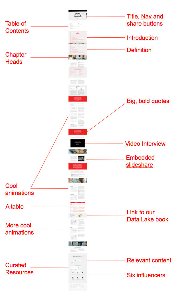
Here’s a view of the whole page, with some annotations:

The benefits of the long-ass web page as B2B content format
There’s nothing on the long-ass page that you’re probably not already doing. But when you put it all together, around a timely topic, you’ve got yourself a great format. Here’s why we like it:
- An intuitive user experience – A well-made long-ass page is easy and fun to consume. There’s nothing to download and it works on any screen size.
- A rich content experience – A good long-ass page brings together lots of different formats into one piece — an engaging, entertaining way to present content.
- Integrated analytics – Because it’s on your web page, you can see it within your web analytics and marketing automation tools as a part of any session or journey.
- Great for cross-promotion – It’s a natural place to link to lots of other relevant content you’ve produced on (or related to) this topic.
- A place for curation and influencer-stroking – It’s great for sharing resources from all over the web — and winning brownie points from influencers (who might just share the piece or even, God forbid, link to it).
- Very search-friendly – The spiders can see everything and it’s clearly marked up to optimise around the keyphrase/topic.
- Super-easy to share – There’s no gating to discourage people from sprinkling the link all over their social graphs. Click-click. Ka-ching.
Critical success factors for the long-ass web page
Long-ass pages aren’t any harder to produce than any other content. But you do need to keep a few things in mind:
- Get your goals straight – Is everyone on board for a ‘definitive’ drill down of a strategic topic? Or do some really want a scrolling demo page or a browse-able reference piece, like a glossary of terms? Get aligned before you start.
- Pick your topic carefully – Think about what your audience would value – and what topic you have a chance of covering well and ranking for.
- Think about structure – Just as you would an ebook, you need to lead the reader through in a linear way (Harry says the long-ass page is the new ebook).
- Start as a collaboration – To do this right, you need your writer, designer, developer and webmaster to sit down together early.
- Make sure your site can handle what you’re trying to do – It sucks to get all the way to the end only to find out your web CMS can’t handle something.
- Keep the page load fast – If the asset pipeline is too heavy, the page will be slow to load. Google hates that. A smart developer can do amazing things to lighten it up.
- Think mobile – Take a look at the proportion of visitors to your website are on a mobile device. There are a lot, so cater to them. (And, if you’re doing anything fancy, consider all the browsers you need to support).
- Manage your CTAs – It’s tempting to just throw in dozens of actions for people to do. Think hard about what’s most important and where the Calls-to-Action fit in the whole experience.
A ‘back to the future’ content format
There are a lot of exciting things happening with new digital content formats (we’re working on some very cool stuff ourselves — watch this space). But sometimes the very best content format is a very simple thing: a web page that acts like a mini-magazine, covering a single, focused topic in a rich, structured, comprehensive and fun way.
So go get long-ass on your web content — and do share any examples you’ve seen or created. We’re content geeks. We love this stuff.

Enjoyed this article?
Take part in the discussion


Comments
Stephanie Tilton Ten Ton Marketing December 15th, 2016
Doug,
Thanks for sharing your blueprint for the LAWP. Looks great! And gave my scroll finger a much-needed workout.
Curious…as you say, ebooks can help earn a form fill. If, as Harry says, the long-ass page is the new ebook, what happens to the lead form? Just wondering how you reconciled that when executing this project for Informatica.
Best,
Stephanie
Doug Kessler January 22nd, 2017
Hi Stephanie.
Good point. For the LAWP, you forego the web form — though you could put one at the end or in the middle, saying “Like this kind of thing? Signm up for more!”
As we look at more and more data across many clients, we’re removing more and more forms. Content wants to be free!