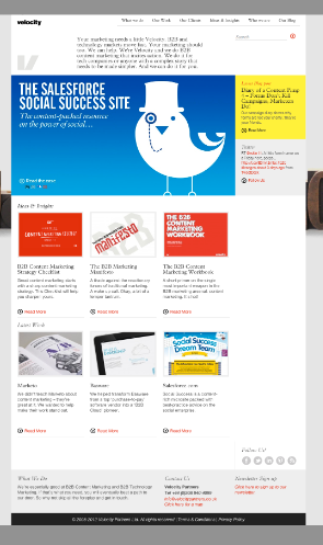
We’ve been talking about mobile marketing in B2B for a long time but, to be honest, we haven’t really practiced what we’ve been preaching.
In fact, while we were out there evangelising about the importance of B2B mobile marketing, I lived in fear that someone would raise a hand (or a tweet or a comment) and say, “Hey, fancy-pants: have you taken a look at your own website on an iPhone?”
My imaginary heckler would have had a point: the Velocity website was far from mobile friendly. Yes, it could be served up to a smartphone browser but it wouldn’t be the kind of experience any visitor would come back for. The smartphone experience was like looking at our site through a toilet paper tube (also known as a der-der). Not any more.
Hallelujah, we’re not hypocrites any more
The new Velocity website (you’re on it) was designed using responsive web design principles. That means it’s based on ‘fluid proportion-based grids that adapt the layout to the viewing environment.’ In other words, it looks good and is easy to navigate on a cinema-sized desktop monitor, a laptop screen, a tablet held sideways, a tablet in portrait mode, a smartphone held sideways and a smartphone in portrait mode. All from the exact same content in the CMS.
For a demo of responsive web design, you can visit our site from a smartphone — or you can just drag the lower right-hand corner of the screen up and to the left until this window is the size of an iPhone. Notice how things start to re-arrange themselves to suit the new dimensions, the menu collapses into the yellow box in the corner, the photos re-size themselves… Cool, huh?
Here’s a side-by-side view — the Insights & Ideas page of our website shown in desktop mode and smartphone mode:


What this means to B2B marketers
It means every website you create can now be as useful to a mobile user as a desktop user – without a lot of extra effort or re-design.
If you take a look at your anayltics, you’ll see how many visits are from people on mobile devices. Take that number and double it for a sense of next year’s mobile traffic. Then double it again for the year after that. It’s a rough prediction but I bet it’s close.
Responsive web design: Dom speaks
To help explain the basics of responsive web design, I asked Dom Whooley, our intrepid designer-coder how he did it. He worked closely with Jim Harrison and the other designers to make our new website happen:
What technologies did you use to give the Velocity website its responsive design?
The old website had nearly 500 blog posts, great SEO performance and was built with WordPress, so the CMS kind of picked itself. The ‘responsive’ bit of the design comes from a grid system called Foundation developed by a company called Zurb. Luckily for me there is a WordPress theme called Reverie which had already done the job of putting the two things together. So basically I adapted the Reverie theme.
How does it work?
To briefly explain in layman’s terms (hopefully), web pages are built in two parts, HTML (Hyper Textual Mark Up Language) for the content, text, images and links etc. And CSS (Cascading Style Sheets) which control the page layout and formatting. Foundation is a sophisticated stylesheet (or three) that gives the page a structure which allows you to create different page layouts for different devices, desktop, tablet and smart phones.
Is it much harder to design for a responsive site than a standard website?
Not harder, there’s just a bit more thought and planning work at the beginning. You need to think about how your design will work on the smallest device (smart phone) as well as the largest (desktop). A friend and web developer said to me a while back that now you should really design your site for mobile first, instead of making it an afterthought. Apparently smart phones are out selling desktops now which also backs up that idea.
What about the coding — is there anything tricky about responsive design?
Always (at least for me) when you look at something new it takes a while to get your head around how it works. Without going into it too deeply there are issues with fixed position page elements, like a navigation that’s always anchored to the top of the browser window. I’m sure there is a work-around which I’ll look at on the next job, when I have a bit more time.
Any downsides or unexpected issues?
There’s the coding problem I mentioned above and I also had a few unexpected things happening when hiding elements on different devices. But nothing major. Again, when you do try something new there’s bound to be things you look back at and think you could do differently but that’s the learning process.
What about for the people who will be editing and updating the site — any different processes they need to follow to keep the site mobile-friendly?
Not really. WordPress still works in exactly the same way. The only thing, and this should be standard practice really for all content editors, is making sure that your images are optimised for the web (smallest file size and not 2500px wide). So if someone looks at your site with a 3G connection you don’t use up all there data download allocation for one image. They won’t thank you for that!
Thanks Dom.

Other responsive web design resources:
- Ethan Marcotte first described responsive web design on this post on A List Apart.
- .Net magazine assembled 50 Tools for Responsive Web Design
- Pepper Digital does a nice, friendly introduction to Responsive Web Design
- Design Modo shares 50 examples of responsive websites

Enjoyed this article?
Take part in the discussion


Comments
robin July 26th, 2012
Great to see you’ve moved to responsive. Just so you know the navigation doesn’t work on windows mobile. Not many of us on windows both worth checking the UX on all mobile devices.
robin July 26th, 2012
Scrap that. It does work on windows mobile but is slow to respond.
Doug Kessler July 31st, 2012
Thanks Robin.
The slow load times may be too to too much content being loaded all at once.
We’re looking at ways to load fewer blog posts, then loading more as the user requests them.
That may help…
But thanks for letting us know.
Evert Albers January 2nd, 2013
I guess you have already found out that you can make separate ‘s that hide and show when it’s appropriate (bottom, top)?
jasa webmobile September 10th, 2013
You will allow it to be appear to be very easy along with your demonstration having said that i locating this matter to get seriously an element that I feel I will in no way realize. It kind of feels also tricky and extremely broad in my opinion. Now i am anticipating in your future send, I most certainly will aim to get the hang on to from it!