We’ve been huge fans of information graphics at Velocity ever since Edward Tufte self-published his brilliant ‘The Visual Display of Quantitative Information‘ book. But as the B2B marketing world has gone B2B infographic crazy in the last year or so, we’ve been much more likely to be disappointed than delighted.
Most B2B infographics are really just simple data charts (bars & pies) made pretty. Or they take a bunch of different data points, give them to an illustrator and turn them into an editorial-like page with big, fat numbers, twitter birds, logos and lots and lots of explanatory text. The data didn’t really have to be visualised. The chunks of stats don’t really hang together or interact or contribute to each other. It’s just a pretty page that might as well be text.
For us, a great information graphic is one in which:
- The visualisation actually adds value – it’s not about making data attractive to children; it’s about making data sing
- The picture tells the story – or many different stories; very little text is needed
- That story is BEST told in graphic form – it’s not just text & data with colours and shapes
- One glance makes you lean forward – making you want to know more & dig deeper
- The graphic combines many dimensions – change in a single value over time is a chart; great B2B infographics have layers
- But there is almost no ink that doesn’t contribute – no twiddles and bar-chart-as-city-skyline (what Tufte calls ‘chartjunk’)
- The final effect is beautiful – they can’t help but be so
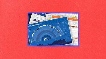
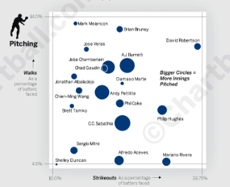
The Chartball posters by Andrew Garcia Phillips, Senior Graphics Editor/Programmer at the Wall Street Journal, tick all these boxes and are an absolute delight. (Joel Avery, the newest hire in our design department turned us on to these. And we’re really glad he did. The Chartball posters are fantastic.) Here’s a small detail on the pitching staff of the 2009 Yankees, strikeouts against walks (pardon the png quality):
Andrew clearly loves data (not just illustration) and that passion leaps off the page. You could spend hours with any one of his poster-sized summaries of a single sports team’s season. And as you absorb the data, the season actually comes to life. You can see, touch and feel the texture of the season. Star players pop out. Winning streaks emerge and fade back to normality. And, best of all, the data sub-plots relate to each other, adding insight and suggesting causation as well as correlation.
We’ve seen very, very few B2B infographics that do all this (and we’ve struggled with it ourselves). But this is what we aspire to.
Anyone out there have any great examples in B2B?

Enjoyed this article?
Take part in the discussion


Comments
There are no comments yet for this post. Why not be the first?