Website dysfunction: It’s not “are we suffering from it?”, but rather “how bad is it?”
You know it as well as we do: a website is a kind of proxy for the organization behind it, and thus a site tends to reflect that organization – warts and all. Because sales and marketing don’t talk, the site’s product pages don’t work well. The US page is full of content; the Russian page….not so much. You get the point.
One of our clients, Magus, has dedicated its life to helping big organizations clean up on both sides of the curtain. That is, they provide probably the world’s best solution to manage and quality-control content on large sites, and they’re thought leaders on the subject of website governance (which they reflect on their blog).
They’ve seen what can go wrong and what needs to go right. So we sat down with them to illustrate (with not a little tongue in cheek) how things can go wrong in their experience, and what’s going to help keep things going right.
To show how things can go wrong, we worked with them on a visual story about a hypothetical website called www.webloop.com (yes, there ARE two meanings). It’s a humorous, but painfully accurate, account of the struggles of many large sites. Click on the image to get the full-sized version.
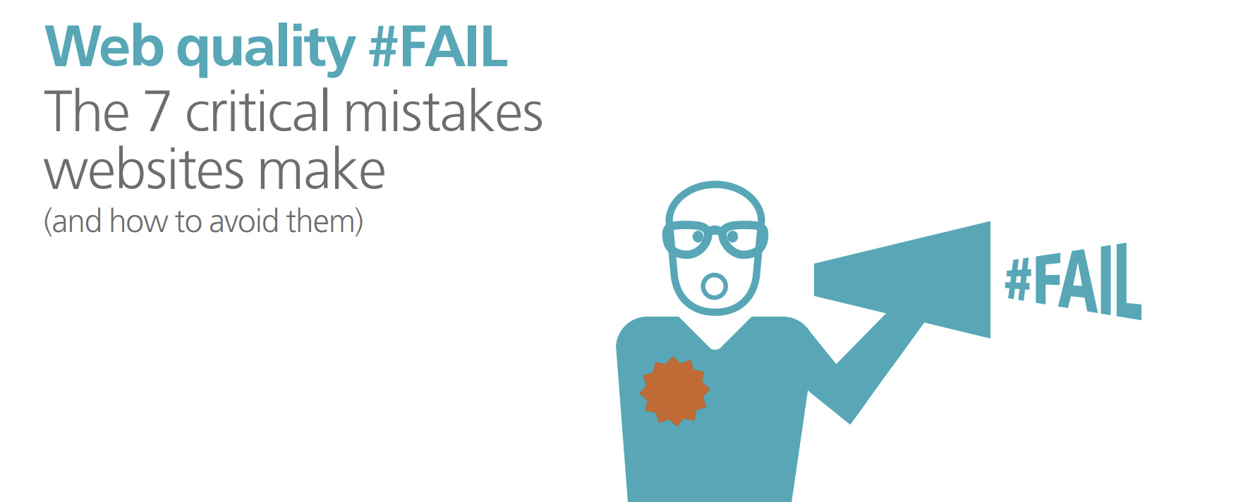
To describe what’s going to keep a website on the straight and narrow, we developed an eBook together with Magus that stakes out the golden rules for website governance. Here are the seven critical mistakes websites make, and how to avoid them. Click on the image to download the full eBook.

Enjoyed this article?
Take part in the discussion


Comments
There are no comments yet for this post. Why not be the first?